
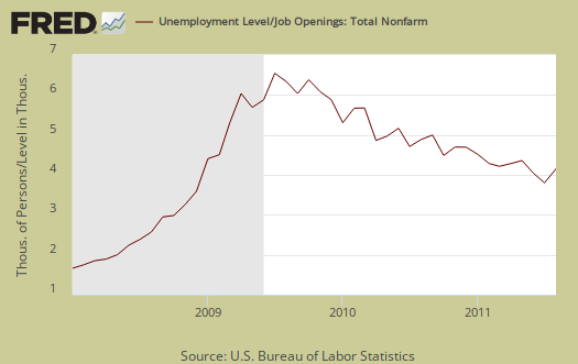
JOLTS stands for Job Openings and Labor Turnover Survey. The August 2011 statistics show there were 4.57 official unemployed people hunting for a job to every position available. There were only 3,056,000 job openings for August 2011, a drop of 4.89%, from the previous month of 3,213,000. For the 37th month, JOLTS again reflects an absolutely horrific jobs market. Below is the graph of number of official unemployed, 13.967 million, per job opening for August 2011.
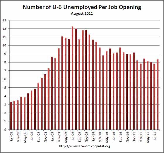
If one takes the official broader definition of unemployment, or U6, in August at 16.2%, the ratio becomes even worse, 8.30* unemployed people per each job opening for August. Below is the graph of number of unemployed, using the broader U6 unemployment definition, per job opening.
If you do not like the use of U-6 to look at the real number of people looking for a job to actual opportunities, consider this number. In August 2011, of those not in the labor force, 6,493,000 were actually wanting a job. U-6 only includes 2,575,000 of this number.
The rates below mean the number of openings, hires, fires percentage of the total employment. Openings are added to the total employment for it's ratio.
- openings rate - 2.3%
- hires rate - 3.1%
- separations rate - 3.0%
Below are raw job openings, way below pre-recession levels.
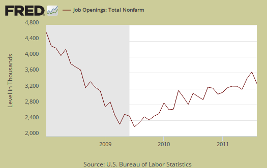
Believe this or not, one month past the so called end of the Great Recession, July 2009, job openings have only increased by 944,000. July 2009 was the low point of job openings, 2,112,000. That's pathetic. In March 2007, a few months before the start of the recession (December, 2007), the number of job openings was 4,755,000.
August hires were 4,014,000, a no change increase of 0.96% from July.

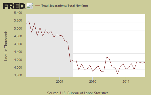
Below are total job separations, 3,968,000, which also were pretty much unchanged from last month. The term separation means you're out of a job through a firing, layoff, quitting or retirement. Notice how separations is almost equal to the number of hires, 4,014,000. Take this as a symptom of the disposable worker syndrome.
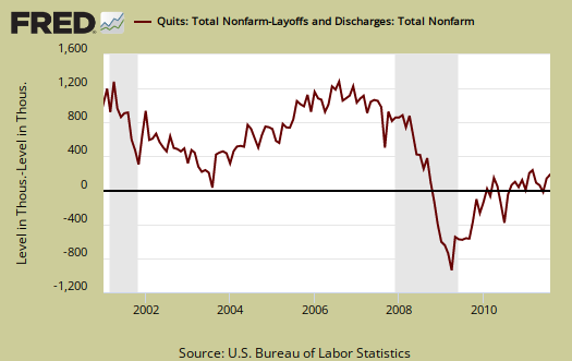
The number of quits or voluntary job separations are still dangerously close to the number of fires, although improved from a year ago, where the two were 46% and 45% respectively. For August, quits were 51% of the total separations whereas layoffs and fires were 42% in August, a 1% ratio increase for quits from last month.
Below are quits minus discharges and layoffs. When quits comes close to firings that means people have little choice in employment. You want to see choice, or quits, rise and be much higher than firings. The below graph shows people still do not have many options when it comes to a job, although it's slightly improving.
The JOLTS takes a random sampling of 16,000 businesses and derives their numbers from that. The survey also uses the CES, or current employment statistics, not the household survey as their base benchmark, although ratios are coming from the household survey, which gives the tally of unemployed.
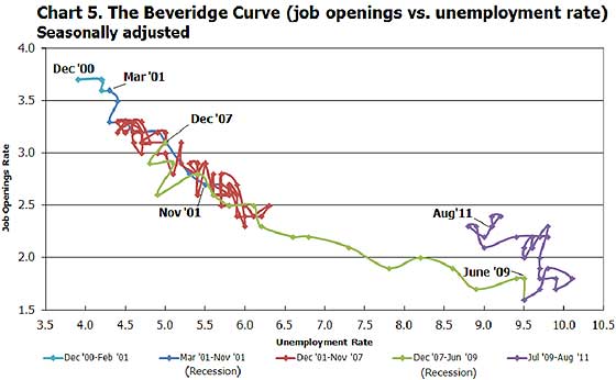
The BLS was kind enough to make a credible Beveridge Curve graph, reprinted below. The Beveridge curve shows the official unemployment rate vs. the job openings rate, over time. If you see a bunch of data points to the far right, that's bad, it means there is long term unemployment and not enough jobs. Look at how we're stuck to the right. August 2011 moved slightly left of July 2011. The green, representing the 2009 time period, shows how fast we went to the right and the purple, which is 2010, 2011, means we are stuck there. All of that purple line is the last two years and shows the U.S. worker is stuck and stuffed.
Additionally, JOLTS includes part-time jobs and does not make a distinction. The August unemployment report showed a dramatic increase in people forced into part-time who need full-time work.
For the JOLTS report, the BLS creates some fairly useful graphs, some of which were reprinted here, and they have oodles of additional information in their databases, broken down by occupational area. The Saint Louis Federal Reserve also had loads of graphing tools for JOLTS. Below is a reprint of the BLS bubble graph, and the first thing to note is how health and educational employment dwarfs manufacturing. For economies of scale, we really need to see that manufacturing bubble grow and grow, it's about 11% of the total economy which is not good for a host of reasons. You can also see how the housing bubble deflation has laid to waste construction jobs. Notice the deflation of government jobs too.
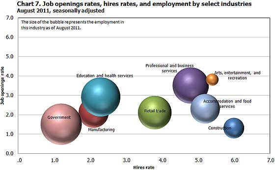
Professional and technical services is notorious to import workers on foreign guest worker Visas, displacing Americans. Employers also quite often put out fictional job openings, demanding perfect skill matches to the point no one on the globe has that experience, all to justify why they offshore outsource jobs. So, assume job openings are inflated, at least in this sector.
* is defined as the official unemployed plus people who are in part-time jobs for economic reasons plus the marginally attached. The marginally attached,
, are officially not part of the civilian labor force,
, and also not seasonally adjusted. The above graph was created by the seasonally adjusted levels of the unemployed, part-time for economic reasons and the marginally attached. The raw U-6 totals can also be calculated by this formula:
where
Recent comments