
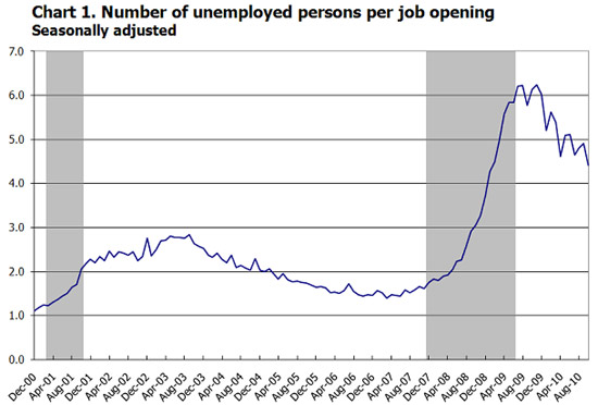
JOLTS stands for Job Openings and Labor Turnover Survey. The October report shows there are now 4.4 official unemployed people hunting for a job to every position available.
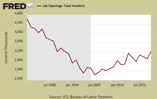
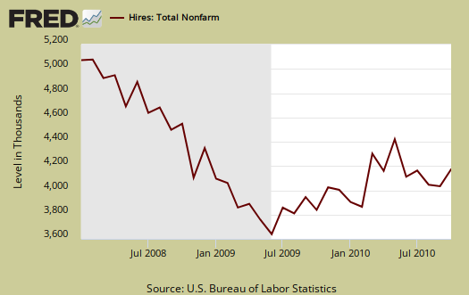
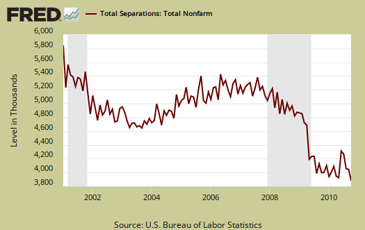
There were 3.4 million job openings on the last business day of October, the U.S. Bureau of Labor Statistics reported today. The job openings rate increased over the month to 2.5 percent. The hires rate remained at 3.2 percent in October, while the separations rate was essentially unchanged at 3.1 percent.
Bear in mind this is only the official 14.8 million unemployed, it's not counting the disappeared unemployed as well as the forced part-time, temporary. So, while this ratio improved by 400,000 job openings in a month, it has a long, long way to go. On job openings, many employers are being absurdly discriminatory and picky on workers. We've seen many employers just resume harvesting, with no intention of actually hiring someone, which partly can explain away the absurdly horrific November unemployment report.
We can see some of this in the actual hires from October, notice how flat it is.
Below are total job separations, with 49% of these being quits. What is strange is not a huge spike during the great recession. Seems people have been losing their jobs the entire decade. I'm not sure what to make out of this inconsistency, but must wonder if normal attrition has been happening and jobs are created....offshore instead. It doesn't make sense to see a drop in total separations during the great recession. If someone can explain this, please leave a comment.
The JOLTS takes a random sampling of 16,000 businesses and derives their numbers from that. The survey also uses the CES, or current employment statistics, not the household survey as their base benchmark. These means all of those people not counted are not in the baseline of this survey.
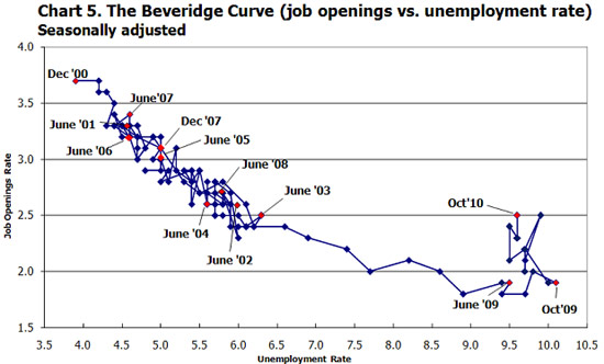
The BLS was kind enough to make a credible Beveridge Curve graph, reprinted below. The Beveridge curve shows the official unemployment rate vs. the job openings rate. If you see a bunch of data points to the far right, that's bad, it means there is long term unemployment and not enough jobs.
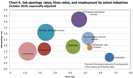
For the JOLTS report, the BLS creates some fairly useful graphs, some of which were reprinted here, and they have oodles of additional information in their databases, broken down by occupational area. Below is a reprint of their bubble graph, abet one must wonder how many foreign guest workers are being included in those professional services jobs.
behind in these overviews on economic reports
I've fallen behind in overviewing and getting the St. Louis FRED graphs on some of the economic report releases. I'm playing catch up and going to hit the most important ones. We get googled all of the time on these, so I try very hard to be dead accurate as well as link first and foremost to the government site which has the original press release as well as plain link over to the St. Louis FRED database itself. That said, I personally find it irritating if I'm hunting for some information and come up with data that is a year old.
Anyway, the press jumped on this report as fabulous news and that's frankly by me as to why they did.