
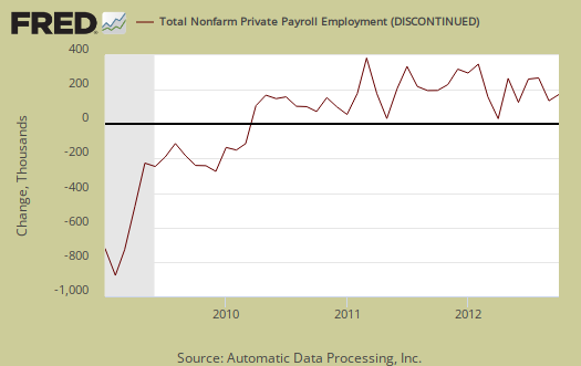
ADP, released their proprietary private payrolls jobs report for October 2012. This month ADP is reporting a gain of 158,000 private sector jobs and starting with this month, Graphed below are the reported private sector jobs from ADP. This report does not include government, or public jobs.
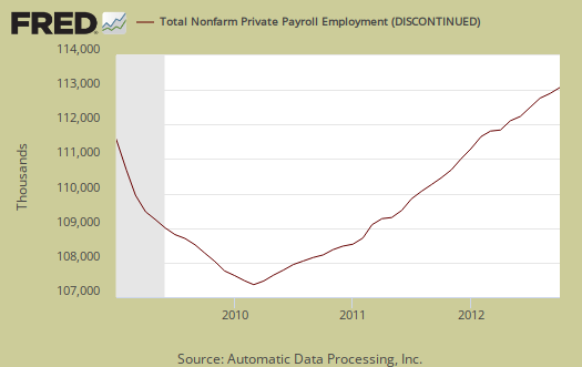
ADP has changed their methodology and expanded their metrics. The entire historical data series for the ADP employment report were revised to reflect these changes. ADP also provides an easier to read table for their statistics, reprinted here for easy view. ADP, along with Moody's increased their breakdown of jobs by business size to five brackets.
| Total U.S. Nonfarm Private Employment: | 158,000 | |||
| • By Company Size | ||||
| • Small businesses: | 50,000 | |||
| · 1-19 employees | 18,000 | |||
| · 20-49 employees | 32,000 | |||
| • Medium businesses: | 27,000 | |||
| · 50-499 employees | 27,000 | |||
| • Large businesses: | 81,000 | |||
| · 500-999 employees | 12,000 | |||
| · 1,000+ employees | 69,000 | |||
| • By Sector | ||||
| • Goods producing | 14,000 | |||
| • Service providing | 144,000 | |||
| • Industry Snapshot | ||||
| • Construction | 23,000 | |||
| • Manufacturing | -8,000 | |||
| • Trade/transportation/utilities | 24,000 | |||
| • Financial activities | 9,000 | |||
| • Professional/business services | 35,000 | |||
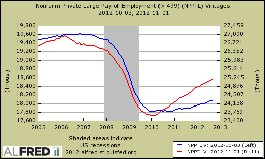
The biggest surprise of this report with the new methodology are the number of jobs created by large businesses. In the previous ADP reports, large business job creation has been next to nil. With their new methodology, magically large businesses are showing job creation. Below is a graph of the old methodology, in blue, scale on the left, against the new methodology, in red, scale on the right, of payrolls for businesses with 500 employees or greater. This is an astounding revision and one must wonder which is to be believed. The fact is previously large businesses were nonexistent in job creation, yet the new methodology which shows large businesses have been hiring. Multinational corporations are business with 500 employees or greater. Other reports show multinational corporations are hiring....outside the United States. Clearly we need to obtain a breakdown of these large businesses on whether they are operating in other countries, offshore outsourcing, or not.
Goods producing industries are manufacturing and construction and considering the improvement in housing data, it's no surprise to see construction jobs increase by 23,000. The decline in manufacturing jobs, on the other hand, isn't a good sign.
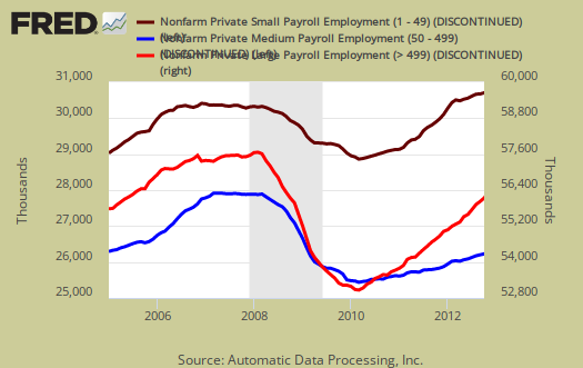
We also have ADP's older three level breakdown in jobs by business size.
Businesses with 49 or fewer employees added 50,000 jobs in October. Employment levels among medium-sized companies with 50-499 employees, rose by 27,000, while employment at large companies – those with 500 or more employees – increased by 81,000.
Below is the graph of ADP private sector job creation breakdown of large businesses (bright red), median business (blue) and small business (maroon), by the above three levels. For large business jobs, the scale is on the right of the graph. Medium and Small businesses' scale is on the left.
This report, if it matches Friday's official unemployment report, would overall imply overall modest job growth. Governments have just been shedding jobs, which are part of the BLS report. The U.S. needs about 100,000 jobs per month, minimum just to keep up with population growth, with the same lousy labor participation rate.
There is a historic strong mismatch between ADP and the BLS jobs report on a month to month basis, yet this might change with the new methodology. The monthly BLS jobs survey (CES) has a 100,000 payroll jobs overall margin of error. Yet because of the new methodology, we hope we can compare ADP's report to BLS private payrolls on a month to month basis. Time will tell and this article is updated on Friday with the release of the BLS report. Additionally ADP, along with Moody's, claims to match the BLS final revision numbers, not the first ones reported. Therefore, when looking for differences between the two reports, it's best to look at a year's previous payroll figures versus the month just released.
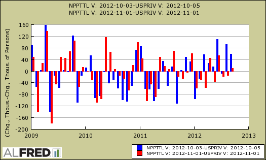
The below graph shows shows how many private sector payroll jobs, each month, ADP was off by in comparison to what the BLS reported. This is a monthly graph, not cumulative. As we can see, it's been rare where the two monthly reports get the exact same private payrolls growth numbers. When the below graph bar is negative, that means the BLS reported a larger number of private jobs than ADP did, when the graph bar is positive, it means ADP reported larger private payrolls. Again, compared are private sector jobs which is different from the BLS headline number. This graph is updated with the October BLS jobs report.

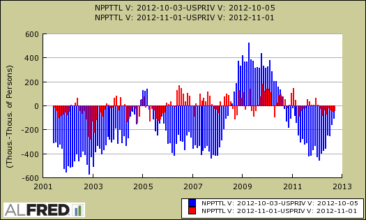
To see the dramatic change of the ADP private payrolls historical data series, below is a graph from the wonderful St. Louis Federal Reserve economic data time machine, Alfred, which shows the dramatic change ADP made in their entire private payrolls data series with the changes to their methodology. The below graph matches the one above, the monthly difference between ADP private payrolls and BLS. The blue is the old difference between ADP and BLS private payrolls, the red is the new. Wow!
Below is the cumulative difference between what the ADP reports as the private nonfarm payroll jobs vs. the BLS (ADP minus BLS). This line shows the divergence, over time in number of nonfarm private payroll jobs reported between the two reports. Previously the difference between ADP and BLS was around 400,000, now we see the cumulative error more in line with the real BLS CES survey margin of error. Here again we see a massive change in the ADP private payrolls methodology. This article is updated with the October BLS private non-farm payrolls data. Below is the difference between the revised series.
The most dramatic change which shows the new methodology and ADP revisions is the cumulative difference between ADP's private payrolls and the BLS CES nonfarm payrolls. The below graph matches the one right above, the cumulative difference between ADP private payrolls and BLS. The blue is the old difference between ADP and BLS private payrolls, the red is the new. Wow Again! Look at the reduction of that difference with the newly revised ADP private payrolls We're really looking at a new payrolls metric, not even close to the old ADP report, with the new methodology.
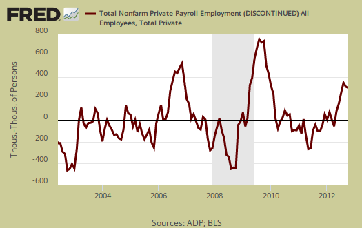
The graph below is the monthly change of private jobs as reported by ADP.
Regardless of the statistical differences between ADP and the BLS, October's report indicates moderate job growth, not the soaring robust growth the United States needs. Sorry folks, 150k range job growth numbers do not mean the Gods are now shining upon us.
The ADP employment report methodology has changed and here comes Moody's into the mix. Beyond some regression curve fitting, the good news is the payroll sample size increased. From their FAQ:
The sample size of the ADP data set from which the newly enhanced report is derived has been expanded from 344,000 to 406,000 U.S. companies, and from 21 million employees to 23 million, which accounts for more than 20 percent of all U.S. private sector employees.
Other changes to ADP's methodology are matching up the timing of the data reported to the BLS CES survey time period. In order to match the BLS CES survey (payrolls, jobs), Moody's is also using a funky VAR regression, which Moody's claims is typically zero, but hey, look at what's included:
Moody’s Analytics uses a restricted structural VAR model to estimate the monthly change in private payrolls by regressing the most recent payroll growth reported by the BLS for each super sector on a constant term and: (1) ADP matched-pair growth rates by industry; (2) lagged values of BLS estimates of growth of employment by industry with industry specific restrictions; and (3) the Philadelphia Federal Reserve’s Aruoba-Diebold-Scotti Business Conditions Index (ADS). The equations for all industries are estimated simultaneously. Thus, the model is made up of 10 endogenous variables—the 10 BLS super sector industries, and 11 exogenous variables—the 10 ADP super sector industries and the ADS index.
Hmmm, time will tell, but hey Moody's, just count the jobs ok? That's what we really want to know and if ya don't match the BLS each month, that's ok, since ADP processes 20% of payrolls, well, maybe there is bias in the samples, due to who uses ADP, but ya know, deal with that one later, don't go throwing around some advanced VAR modeling into the payroll mix, just sayin'.
Here is our overview of last month's ADP private sector jobs report overview, only graphs revised.
ADP overview heavily revised, read again if you did already
I heavily revised this overview from it's original. Graphs were added to show the dramatic change in the ADP private payrolls.
New graphs were added. Unfortunately ADP didn't really come out and tell people all of their data for all time was significantly revised. I did go looking for that and unfortunately in my trusty time machine, I grabbed the wrong vintage date originally, so the dramatic revisions didn't pop out at me.
Good news is I went back and looked and found 'em. Just ASTOUNDING the changes and one would think ADP and Moody's would amplify that everything has changed in the data itself.
Happy eye candy!
number of jobs to equal static employment
First and most importantly - thanks for your work.
I am not the statistical type. I usually default to the most simple models. the statement "The U.S. needs about 100,000 jobs per month, minimum just to keep up with population growth, ..." includes a lot of data on retirement age, participation rate, green card and alien workers. Too complicated for me.
Please consider National Center for Education Statistics http://nces.ed.gov/fastfacts/display.asp?id=372
estimates 3.4 million students graduate from high school in 2012-13. that is 283,000 monthly. OK, some go to college, some are disabled, ... but some never graduate from high school. The same source estimates 14.8 million in grades 9 to 12. Divide by 4 years = 3.7 million per year or 308,000 monthly new workers entering the labor force.
Our current employment situation is not sustainable.
Best wishes
NCGs and such
I will dig into it. I have in the past to show
a. there is no STEM, or "tech" worker shortage
b. there is a glut of PhDs in this country
c. unemployment rates are over double what they should be in these areas
d. the bad unemployment rates for teenagers and those < 22 years of age are not because they all went to school.
(NCG = New College Graduate)
I'm working on a site redesign to make it easier to find things. But for now, another way is to do a Google site search.
We literally have over 6000 posts, thousands related to labor markets, employed, jobs.