
ADP's proprietary private payrolls jobs report gives us a monthly gain of 215,000 private sector jobs for November 2013. This is the strongest growth for the year. The goods sector had the best showing in job growth since early 2012 and the service sector showed the largest job gains for the year. This report does not include government, or public jobs. While the official BLS employment report and ADP most often do not match on the monthly private payrolls figure, this still is a very positive report for jobs.

Delving deeper into ADP's report, jobs gains were in the service sector were 176,000 private sector jobs, unusually high for the private service sector. The goods sector gained 40,000 jobs. Professional/business services jobs grew by 38,000. Trade/transportation/utilities showed the strongest growth with 45,000 jobs. Financial activities payrolls gained 5,000 jobs.
Construction work, part of the goods sector, gained 18,000 jobs. Manufacturing came alive with 18,000 jobs for the month. Graphed below are the month job gains or losses for the five areas ADP covers, manufacturing (maroon), construction (blue), professional & business (red), trade, transportation & utilities (green) and financial services (orange).

Moody's Mark Zandi was shocked at the low impact the government shutdown and debt ceiling crisis had, although most of America is crying O'Rly? over political shenanigans at this point and it seems the economy might be improving in spite of our government.
The job market remained surprisingly resilient to the government shutdown and brinkmanship over the treasury debt limit. Employers across all industries and company sizes looked through the political battle in Washington. If anything, job growth appears to be picking up.
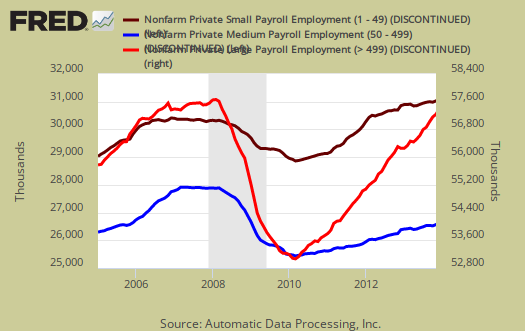
ADP reports payrolls by business size, unlike the official BLS report and this month growth was across the board. Small business, 1 to 49 employees, fueled the private payroll gains by adding 102,000 jobs with establishments having less than 20 employees adding 57,000 of those jobs. ADP counts businesses with one employee in there figures. Medium sized business payrolls are defined as 50-499 employees, added they added 48,000 jobs. Large business added 65,000 to their payrolls. If we take the breakdown further, large businesses with greater than 1,000 workers, added 70,000 of those large business jobs, which means businesses with 500 to 999 employees shed jobs by -5,000. The unusual thing this month is medium size business growth. Typically we see most job growth in very small and the large businesses.
Below is the graph of ADP private sector job creation breakdown of large businesses (bright red), median business (blue) and small business (maroon), by the above three levels. For large business jobs, the scale is on the right of the graph. Medium and Small businesses' scale is on the left.
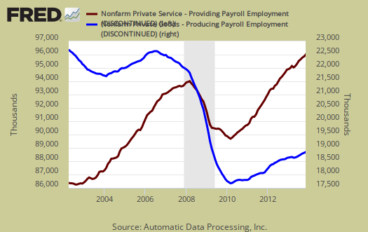
One of the more interesting aspects of the ADP report is the breakdown of the private sector by service producing and goods producing jobs. The service sector are disproportionately lower paying jobs as a whole in comparison to goods producing jobs, even while including the financial, professional and business services sectors are part of services. Below is the graph of ADP service sector (maroon, scale left) jobs against their goods production jobs (blue, scale right).
The ADP employment report, if it matches the BLS official unemployment report, would overall imply overall more than enough job growth to keep up with population, as this is just the private sector job growth. The U.S. needs about 115,000 jobs per month, minimum just to keep up with population growth, abet with the same lousy, artificially low, labor participation rates.
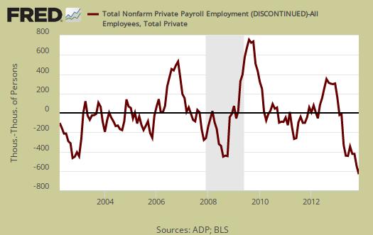
Now that we rejoice and Wall Street shudders in fear quantitative easing will be withdrawn, a reality check. The ADP private payrolls rarely matches the BLS monthly employment figures. The monthly BLS jobs survey (CES) has a 100,000 payroll jobs overall margin of error. ADP changed their methodology and now claim to match the BLS private payrolls, but only historically, after revisions. The below graph shows shows how many private sector payroll jobs, each month, ADP was off by in comparison to what the BLS reported. This is a monthly graph, not cumulative. As we can see, it's been rare where the two monthly reports get the exact same private payrolls growth numbers. When the below graph bar is negative, that means the BLS reported a larger number of private jobs than ADP did, when the graph bar is positive, it means ADP reported larger private payrolls. Again, compared are private sector jobs which is different from the BLS headline number. The graph is updated with the BLS jobs figures.

Below is the cumulative difference between what the ADP reports as the private nonfarm payroll jobs vs. the BLS (ADP minus BLS). This line shows the divergence, over time in number of nonfarm private payroll jobs reported between the two reports. Previously the difference between ADP and BLS was around 100,000, now we see the cumulative error growing past the BLS margin of error. Here again we see a massive change in the ADP private payrolls methodology and benchmarking and the way off amount might be due to a misalignment of annual benchmarks. Regardless, this is why one cannot infer from the ADP report what the BLS figures will show. ADP claims their private payrolls cover 24 million jobs with 416 thousand businesses in the U.S. This represents about 20% of U.S. payrolls. The graph is updated with BLS private non-farm payrolls data.
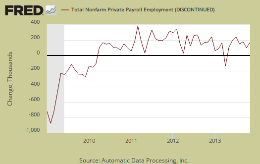
The graph below is the monthly change of private jobs as reported by ADP. At the absolutely bare minimum, the United States needs 1.2 million jobs per year, or 100,000 per month, total jobs, including public sector jobs, to keep up with additional new workers in the labor supply caused by population growth with the current terrible labor market conditions assumed.
Regardless of the statistical differences between ADP and the BLS, these payroll figures are quite a positive sign something might be finally buzzing in the economy. America needs a tsunami of good news and indicators, no doubt, but this report gives some hope that things might be finally turning around. After all economic disaster has only been going on for 6 years now (except for Wall Street of course).
Here is our overview of last month's ADP private sector jobs report overview, only graphs revised. This article goes into the methodology details on the ADP report changes and compares historical data of the two methodologies in graphs.
ADP themselves have really improved the visuals on their website for more perspectives, breakdowns and charts of their statistics.
Recent comments