
ADP's proprietary private payrolls jobs report gives us another stunted employment preview by reporting a monthly gain of 169,000 private sector jobs for April 2015. Manufacturing jobs are truly a bad omen with 10,000 reported lost. Construction on the other hand is still in recovery with 23,000 April jobs gained. By the numbers the overall job growth appears to be decelerating, and ADP blames the collapse in oil prices. This report does not include government, or public jobs. The official BLS employment report will be released on Friday.
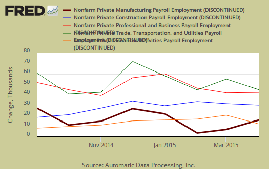
ADP's reports in the service sector alone job gains were 170,000 private sector jobs. The goods sector lost jobs and declined by 1,000. Unfortunately ADP does not give a lot of breakdown in their job categories but clearly other areas of the goods producing sector lost jobs. Professional/business services jobs grew by 34,000. Trade/transportation/utilities showed the strong growth with 44,000 jobs. Financial activities payrolls added 7,000 jobs. As previously noted, Manufacturing lost 10,000 jobs. Graphed below are the monthly job gains or losses for the five areas ADP covers, manufacturing (maroon), construction (blue), professional & business (red), trade, transportation & utilities (green) and financial services (orange). As we can see manufacturing's figures are a rarity.
ADP reports payrolls by business size and this month companies with 500 up to 1,000 employees really hit the slow down tank as their payrolls gains were a big fat zero. Small business, 1 to 49 employees, added 94,000 jobs with establishments having less than 20 employees adding 54,000 of those jobs. ADP does count businesses with one employee in there figures. Medium sized business payrolls are defined as 50-499 employees, added 70,000 jobs. Large business added 5,000 to their payrolls, all with 1,000 or more workers.
Below is the graph of ADP private sector job creation breakdown of large businesses (bright red), median business (blue) and small business (maroon), by the above three levels. For large business jobs, the scale is on the right of the graph. Medium and Small businesses' scale is on the left.

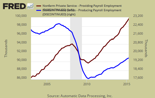
One of the more interesting aspects of the ADP report is the breakdown of the private sector by service producing and goods producing jobs. The service sector are disproportionately lower paying jobs as a whole in comparison to goods producing jobs, even while including the financial, professional and business services sectors are part of services. Below is the graph of ADP service sector (maroon, scale left) jobs against their goods production jobs (blue, scale right).
The ADP employment report, if it matches the BLS official unemployment report, would overall imply just barely enough overall enough job growth to keep up with population, as ADP reports just the private sector job growth. The U.S. needs about 115,000 jobs per month, minimum just to keep up with population growth, abet with the same lousy, artificially low, labor participation rates.
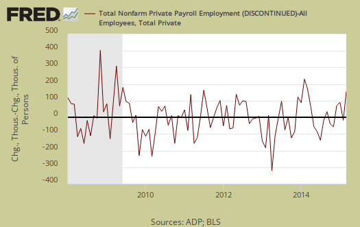
The ADP private payrolls rarely matches the BLS monthly employment figures. The monthly BLS jobs survey (CES) has a 100,000 payroll jobs overall margin of error. ADP changed their methodology and now claim to match the BLS private payrolls, but only historically, after revisions. The below graph shows shows how many private sector payroll jobs, each month, ADP was off by in comparison to what the BLS reported. This is a monthly graph, not cumulative. As we can see, it's been rare where the two monthly reports get the exact same private payrolls growth numbers. When the below graph bar is negative, that means the BLS reported a larger number of private jobs than ADP did, when the graph bar is positive, it means ADP reported larger private payrolls. Again, compared are private sector jobs which is different from the BLS headline number. The graph will be updated with the BLS jobs figures.
Below is the cumulative difference between what the ADP reports as the private nonfarm payroll jobs vs. the BLS (ADP minus BLS). This line shows the divergence, over time in number of nonfarm private payroll jobs reported between the two reports. Due to annual revisions, ADP and the BLS are matching up once again in reported cumulative private sector jobs. Regardless, one cannot infer from the ADP report what the BLS figures will show on new releases. ADP claims their private payrolls cover 24 million jobs with 416 thousand businesses in the U.S. This represents about 20% of U.S. payrolls. The graph will be updated with BLS private non-farm payrolls data.
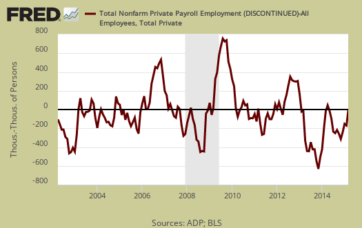
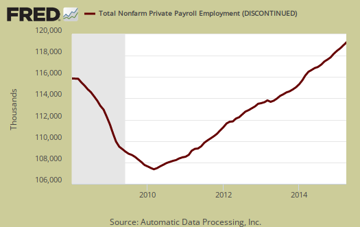
The graph below is the monthly change of private jobs as reported by ADP. At the absolutely bare minimum, the United States needs 1.2 million jobs per year, or 100,000 per month, total jobs, including public sector jobs, to keep up with additional new workers in the labor supply caused by population growth with the current terrible labor market conditions assumed.

Regardless of the statistical differences between ADP and the BLS, these payroll figures are a sign of deceleration and the loss of manufacturing jobs is most disconcerting. Additionally the big headline figure doesn't say what kind of jobs are being added. Do you want fries with that jobs are assuredly not equal to manufacturing positions. Overall, ADP's report is just another foreboding of a slowing economy that is now heading into Q2.
ADP themselves have some great visuals on their website for more perspectives, breakdowns and charts of their statistics. Here are our overviews from previous months, only graphs revised. This article goes into the methodology details on the ADP report changes and compares historical data of the two methodologies in graphs.
It's hard to compete with $0.20/hour
Obama must support child labor in Vietnam (used by Nike, the corporate tax dodger).
http://www.huffingtonpost.com/2015/05/06/obama-tpp-nike_n_7223256.html
Check out Nike's slaver labor camps...
http://manufacturingmap.nikeinc.com/
So how do you sell a shoe for $180 that cost just $5 labor to make?
http://www-personal.umich.edu/~lormand/poli/nike/nike101-4.htm