
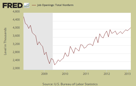
The BLS March JOLTS report, or Job Openings and Labor Turnover Survey shows there are 3.1 official unemployed per job opening, the same as last month. Job openings declined -1.4% from last month to a total of 3,844,000. People hired in March declined by -4.3% to 4.259 million. Real hiring has only increased 18% from June 2009. Job openings are still below pre-recession levels of 4.7 million. Job openings have increased 81% from July 2009. The story for jobs is the same flat line drum beat for March. There is never enough actual hiring in addition to not enough openings.
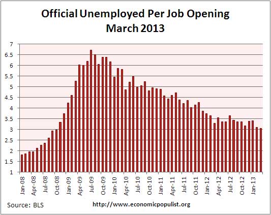
There were 1.8 official unemployed persons per job opening at the start of the recession, December 2007. Below is the graph of the official unemployed per job opening. The official unemployed ranked 11,742 million in March 2013.
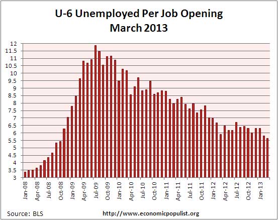
If one takes the official broader definition of unemployment, or U-6, the ratio becomes 5.7* unemployed people per each job opening. The March U-6 unemployment rate was 13.8%. Below is the graph of number of unemployed, using the broader U-6 unemployment definition, per job opening.
We have no idea the quality of these job openings as a whole, as reported by JOLTS, or the ratio of part-time openings to full-time. The rates below mean the number of openings, hires, fires percentage of the total employment. Openings are added to the total employment for it's ratio.
- openings rate: 2.8%
- hires rate: 3.2%
-
separations rate: 3.1%
- fires & layoffs rate: 1.3%
- quits rate: 1.6%
- other rate: 0.3%
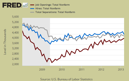
Graphed below are raw job openings. Job openings are still below the 4.7 to 4.3 million levels of 2007.
Since the July 2009 trough, actual hires per month have only increased 18%. This is simply terrible and the most important indicator in our view for employers are clearly refusing to increase hiring, across the board and thus not recover from our jobs crisis. Businesses can say there are job openings, but if they do not hire an American and fill it, what's the point? Additionally this shows there is no labor shortage of any kind considering hiring really hasn't increased much since the height of the recession.

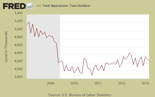
Below are total job separations, 4,213 million for the month and a slight increase of 0.8% from last month. The term separation means you're out of a job through a firing, layoff, quitting or retirement.
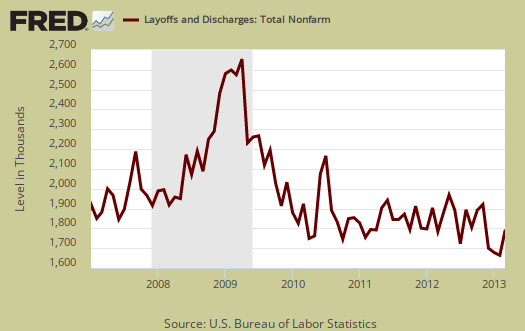
Layoffs and firings were 1.693 million, a 7.7% increase from last month. Below is a graph of just layoffs and firings. Layoffs and firings were across the board so we cannot blame the sequester, although layoffs and firings are at pre-recession levels. One can see from labor flows while businesses are not thrashing their workforce so much, they are also not adding to their payrolls.
Graphed below are openings separations and hires levels, so we can compare the types of labor flows. While layoffs have declined to pre-recession levels, it is the flat line hires (blue) that is the problem, beyond not enough job openings (red) for the unemployed. There is simply not enough hiring going on to get people back to work. Anyone who claims a labor shortage is also easily disproved by these figures. A labor shortage would imply more job openings than unemployed available to fill them.
From a year ago, there is a 1.7 million net job gain and this is another 100,000 decrease from what was reported last month. Annual revisions from the employment statistics are incorporated into this report.. With 11.7 million official unemployed, a 1.7 million annual job growth isn't going to make much of a dent in dropping the unemployed levels beyond people giving up looking for work.
Over the 12 months ending in March 2013, hires totaled 51.8 million and separations totaled 50.1 million, yielding a net employment gain of 1.7 million. These figures include workers who may have been hired and separated more than once during the year.
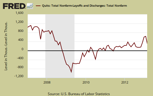
Graphed below are people who quit their jobs minus those who were fired and laid off. The lower the bar on the below graph, the worse labor conditions are. The number of quits were 2.16 million, a -5.5% change from last month. July 2009 saw 1.8 million quits. People quit their current jobs often to obtain better ones. People feeling free enough to leave their current position also hasn't changed much for the year. Additionally quit statistics are still way below pre-recession levels of 2.8 million. People are clearly not voluntarily leaving their jobs because the job market is bad, even though the jobs slaughter of 2009 where people were laid off and fired in mass is over.
For the JOLTS report, the BLS creates some fairly useful graphs beyond the above and they have oodles of additional information in their databases, broken down by occupational area. That said, one doesn't know if the openings are quality jobs from the JOLTS statistics. The St. Louis Federal Reserve also had loads of graphing tools for JOLTS.
The JOLTS takes a random sampling of 16,000 businesses and derives their numbers from that. The survey also uses the CES, or current employment statistics, not the household survey as their base benchmark, although ratios are coming from the household survey, which gives the tally of unemployed.
The March 2013 unemployment rate was 7.6%. JOLTS includes part-time jobs and does not make a distinction between part-time, full-time openings. A job opening reported to the survey could literally be take out the trash twice a week and be counted. This is a shame, it would be nice to know a little more about the quality of these new opportunities. Here are our past JOLTS overviews, unrevised.
* is defined as the official unemployed plus people who are in part-time jobs for economic reasons plus the marginally attached. The marginally attached,
, are officially not part of the civilian labor force,
, and also not seasonally adjusted. The above graph was created by the seasonally adjusted levels of the unemployed, part-time for economic reasons and the marginally attached, raw totals. Another way to calculate this figure is:
where
Recent comments