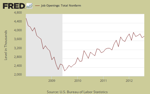
The BLS JOLTS report, or Job Openings and Labor Turnover Survey describes the pathetic job market. Once again, little has changed, the never ending drum beat and mantra of our dead in the water labor market never ceases. The August 2012 statistics show there were 3.52 official unemployed persons for every position available*. There were 3.561 million job openings for August, a -0.9% decrease from the previous month of 3,593,000. Openings are still way below pre-recession levels of 4.7 million. Job openings have increased 63% from their August 2009 Mariana Trench trough, yet real hiring is a distant memory. There were 1.8 persons per job opening at the start of the recession, December 2007. The job market is horrific and worse than last month. Below is the graph of official unemployed, 12.088 million, per job opening.
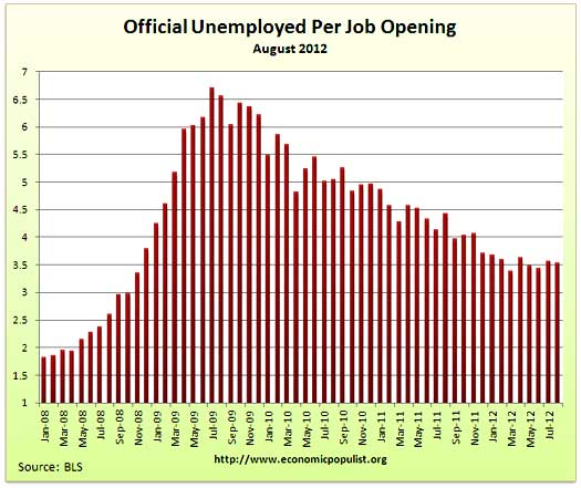
Job openings are all types of jobs, temporary, part-time, seasonal and full-time. Hires are U.S. citizens, permanent residents, illegals and foreign guest workers.
If one takes the official broader definition of unemployment, or U-6, the ratio becomes 6.5** unemployed people per each job opening. The August U-6 unemployment rate was 14.7%. Below is the graph of number of unemployed, using the broader U-6 unemployment definition, per job opening.
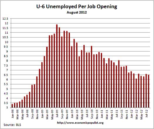
We have no idea the quality of these job openings as a whole, as reported by JOLTS, or the ratio of part-time openings to full-time.
The rates below mean the number of openings, hires, fires percentage of the total employment. Openings are added to the total employment for it's ratio. Openings rate dropped a 10th of a percentage point from the previous month, the hires rate, which is what is important here, ticked up a 10th of a percentage point. Separations increased 0.3 percentage points from July and even worse news, that's because fires and layoffs increased by 0.2 percentage points. The job market is stagnant and a dead pool.
- openings rate - 2.6%
- hires rate - 3.3%
- separations rate - 3.3%
- fires & layoffs rate - 1.4%
- quits rate - 1.6%
Below are raw job openings, still below the 4.7 to 4.3 million levels of 2007.
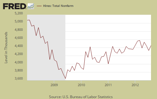
August hires were 4,390 million, an increase of 2.6% from the previous month. Since the July 2009 trough, actual hires per month have only increased 19%. This is simply terrible as an indicator for employers are clearly refusing to increase hiring, across the board.
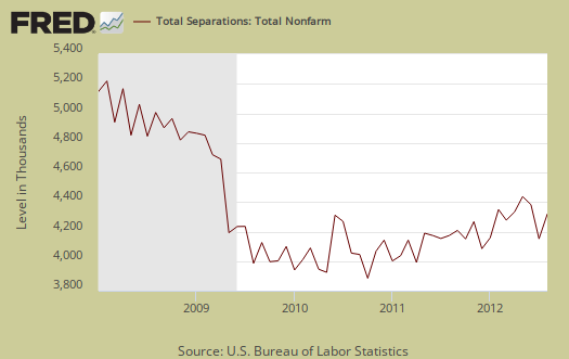
Below are total job separations, 4.354 million, a 6.5% increase from the previous month. The term separation means you're out of a job through a firing, layoff, quitting or retirement.
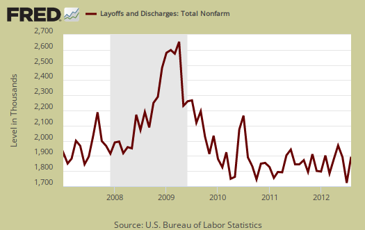
Below is a graph of just layoffs and firings. We suspect this went down in September, still an increase to early recession levels is not a good sign.
Every month the JOLTS report looks like employment musical chairs. We have an unchanged 1.8 million overall yearly net job gain even though time marches on.
Over the 12 months ending in August 2012, hires totaled 51.6 million and separations totaled 49.8 million, yielding a net employment gain of 1.8 million. These figures include workers who may have been hired and separated more than once during the year.
Graphed below are people who quit their jobs minus those who were fired and laid off. The lower the bar on the below graph, the worse labor conditions are. The number of quits were 2,.140 million for August and are still way below pre-recession levels of 2.8 million. People are clearly not voluntarily leaving their jobs because the job market is so bad, even though the jobs slaughter of 2009 where people were laid off and fired in mass appears to be over.

The JOLTS takes a random sampling of 16,000 businesses and derives their numbers from that. The survey also uses the CES, or current employment statistics, not the household survey as their base benchmark, although ratios are coming from the household survey, which gives the tally of unemployed.
The BLS was kind enough to make a credible Beveridge Curve graph, reprinted below. The Beveridge curve shows the official unemployment rate vs. the job openings rate, over time. If you see a bunch of data points to the far right, that's bad, it means there is long term unemployment and not enough jobs. Up and left in the Beveridge curve is good, it means there are jobs, people are getting hired, life is good. A right and up move in the Beveridge curve can indicate a skills mismatch. Look at how we're stuck to the right, but down, which means, pure and simple, there are not enough jobs and we're just not expanding enough for more jobs. The green, representing the 2009 time period, shows how fast we went to the right and the purple, which is 2010-2012, means we are stuck in job market malaise. Look at how the purple line just kind off flips back and forth down and to the right. That's our labor market spinning her wheels, stuck in the mud.
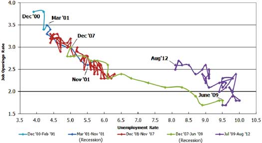
The August 2012 unemployment rate was 8.1%.
JOLTS includes part-time jobs and does not make a distinction between part-time, full-time openings. A job opening reported to the survey could literally be take out the trash twice a week and be counted. This is a shame, it would be nice to know a little more about the quality of these new opportunities.
For the JOLTS report, the BLS creates some fairly useful graphs and they have oodles of additional information in their databases, broken down by occupational area. That said, one doesn't know if the openings are quality jobs from the JOLTS statistics. The St. Louis Federal Reserve also had loads of graphing tools for JOLTS.
Here is last month's JOLTS overview, unrevised.
*The BLS rounds up to 1 decimal place.
** is defined as the official unemployed plus people who are in part-time jobs for economic reasons plus the marginally attached. The marginally attached,
, are officially not part of the civilian labor force,
, and also not seasonally adjusted. The above graph was created by the seasonally adjusted levels of the unemployed, part-time for economic reasons and the marginally attached, raw totals. Another way to calculate this figure is:
where

Today's initial claims are ridiculous - this economy is CRAP
Awesome and truly unbelievable news, initial claims dive the most in 4 1/2 years right in time for VP debate. No, I'm not going conspiracy on this, but come on, these numbers will be revised up from 339,000 up to 370,000-380,000 next week. But no one looks at the revisions, except blogs and those who read them (guilty). What was last week's number, 367,000? Anyway, keep on popping the champagne govt. and Wall Street (actually, Wall Street's government), because even if these numbers were accurate in any way, the JOLTS numbers, jobs created (what was that, 119,000?), and miserable part-time, no benefits explosion is just more evidence we are suffering. 2012 and companies still find 300,000+ people somewhere to kick to the curb every week - that's brutal. So as Ayn Rand Fanboy and Joe "Wow, I'm a VP, look at me" Biden carry on and on about which one loves America more and who really looks out for the middle class while accepting donations from fat cat donors, we continue to witness our economic decline daily. When we see jobs that don't have 100+ applicants per opening, use a person's skills, experience, and degrees, and that could actually buy a house when combined with a spouse's income, then pop the Dom.
LOL, I'll bet the CT is roaring on this one
I wasn't planning on overviewing initial claims but looks good to write up something. It's volatile.