
The BLS JOLTS report, or Job Openings and Labor Turnover Survey shows there are 2.9 official unemployed per job opening for October 2013. The headlines blare job openings are at the highest level in five years, but that's not the real story as hiring is way below pre-recession levels. Job openings have increased 80% from July 2009, while hires have only increased 24% from the same time period. Every month JOLTS reports the same bleak labor market conditions with little improvement. Despite what many want and the press headlines imply, this month's report is no different. Once again the United States labor market is showing little change.
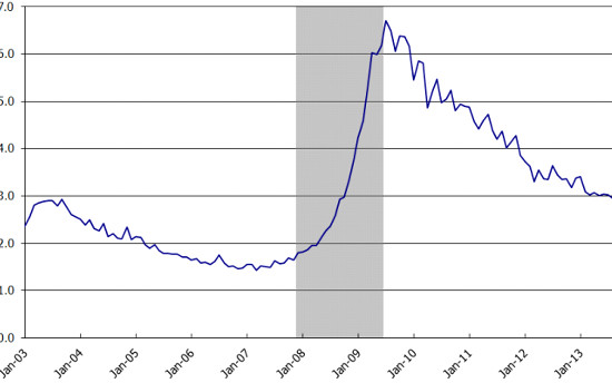
There were 1.8 official unemployed persons per job opening at the start of the recession, December 2007. Below is the graph of the official unemployed per job opening, currently at 2.9 people per opening. The reason for the slight decline is the drop in the official unemployment rate.
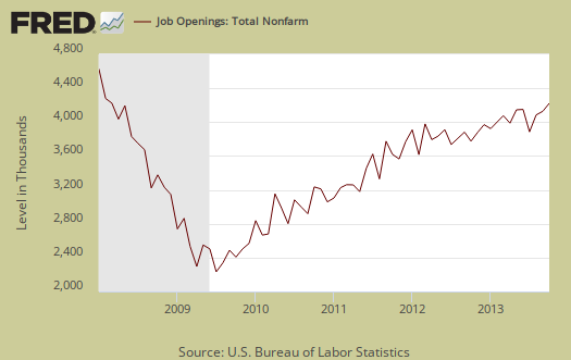
JOLTS reports any job opening, regardless of pay. There is no information on the ratio of part-time openings to full-time ones. Graphed below are raw job openings. Job openings are still below the 4.7 to 4.3 million levels of 2007. Currently job openings stand at 3,925,000, so clearly headlines proclaiming job openings at the highest level in five years is simply feel good headline buzz.
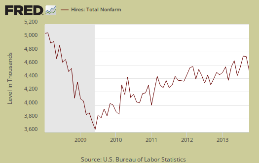
Since the July 2009 trough, actual hires per month have only increased 24%. This is simply terrible and the most important indicator in our view for employers are clearly refusing to increase hiring, across the board and thus not recover from our jobs crisis. Businesses can say there are job openings, but if they do not hire an American and fill it, what's the point? The truth is business are refusing to hire Americans and this is while profits are at roaring highs. Below is the graph of actual hires, currently at 4,509,000, to show how flat line actual hiring really is.
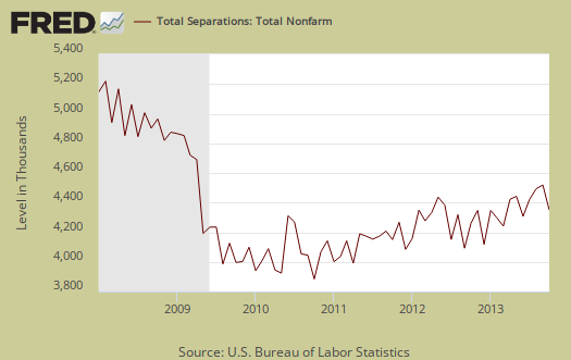
Graphed below are total job separations, currently at 4.149 million, and fairly static for the past year. The term separation means you're out of a job through a firing, layoff, quitting or retirement.
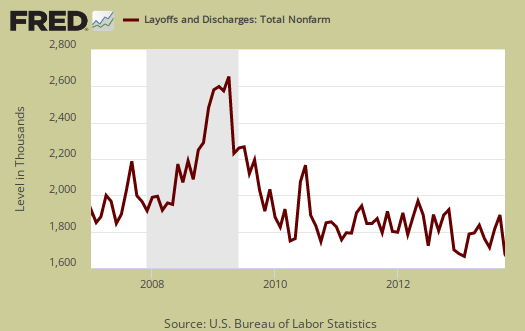
Layoffs and firings were 1.474 million. Below is a graph of just layoffs and firings. One can see from labor flows while businesses are not trashing their workforce so much, they are also not adding to their payrolls. Labor flows means the way people are hired, stay at a job, quit, get fired, get another job and so on. It is the overall flow of the labor market for as people are get jobs, they also lose them.
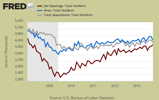
Graphed below are openings separations and hires levels, so we can compare the types of labor flows. While layoffs have declined to pre-recession levels, it is the flat line hires (blue) that is the problem, beyond not enough job openings (red) for the unemployed. There is simply not enough hiring going on to get people back to work. Anyone who claims a labor shortage is also easily disproved by these figures. A labor shortage would imply more job openings than unemployed available to fill them.
Another fact rarely mentioned in the press is the pathetic annual job gains. Permanent job gains are consistently around two million with these persistently high unemployment levels means the job crisis seemingly is without end and employment is not permanent. Note the contrast between the BLS payroll figures. The reason this figure is lower is labor flows. People are being separated from their jobs, so one can have job growth yet if people are then fired later, or that job is temporary and goes away, by labor flows that loss results in less net employment gains.
Over the 12 months ending in October 2013, hires totaled 53.0 million and separations totaled 51.0 million, yielding a net employment gain of 2.0 million. These figures include workers who may have been hired and separated more than once during the year.
Graphed below are people who quit their jobs minus those who were fired and laid off. The lower the bar on the below graph, the worse labor conditions are. Workers quit their current jobs often to obtain better ones. People feeling free enough to leave their current positions is considered a positive labor market sign. . Quit statistics are still way below pre-recession levels of 2.9 million. This is another JOLTS statistic the press is trying to make it sound like the labor market is healthy. Quits were 2.385 million, obviously not at pre-recession levels and the quits rate, the percentage of quits to employment, has remained at 1.7 for months. While the October spike up is positive, note it is still below pre-recession levels.

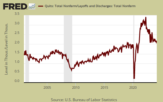
Below is a graph of the quits to layoffs ratio. This ratio of people who quit their jobs vs. those who were fired gives an indicator of worker churn as well as if there might be a shortage. If the ratio is below 1.0, this means more people are being laid off and fired than people who quit. When the ratio is much higher, this means more people quit their jobs and thus implies there is better opportunity elsewhere and workers feel free enough to move on to obtain those new better jobs. The quits to fires ratio was 1.8 in 2006. Here again we see a ratio just at the cusp of the great jobs slaughter, not the highs of early in the decade. So while the spike up is positive, it is one month's worth of data and does not imply the job market has suddenly recovered.
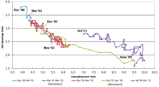
The BLS publishes a Beveridge Curve graph, reprinted below. The Beveridge curve shows the official unemployment rate vs. the job openings rate, over time. If you see a bunch of data points to the far right, that's bad, it means there is long term unemployment and not enough jobs. Up and left in the Beveridge curve is good, it means there are jobs, people are getting hired, life is good. A right and up move in the Beveridge curve can indicate a skills mismatch. Look at how we're stuck to the right, but down, which means, pure and simple, there are not enough jobs and we're just not expanding enough for more jobs. The green, representing the 2009 time period, shows how fast we went to the right. The purple line is 2010-2013 and means we are stuck in job market malaise, moving very slowly back to the left upwards portion of the graph which would indicate a healthy job market. The red line, which wasn't that great of a labor market, is pre-recession. As one can see, the United States isn't even close to the red line for a labor market. In other words, the Beveridge curve shows just as the above statistics do that the labor market is much too weak still to recovery from the 2009 jobs slaughter.
For the JOLTS report, the BLS creates some fairly useful graphs beyond the above and they have oodles of additional information in their databases, broken down by occupational area. That said, one doesn't know if the openings are quality jobs from the JOLTS statistics. The St. Louis Federal Reserve also had loads of graphing tools for JOLTS.
The JOLTS takes a random sampling of 16,000 businesses and derives their numbers from that. The survey also uses the CES, or current employment statistics, not the household survey as their base benchmark, although ratios are coming from the household survey, which gives the tally of unemployed.
The October 2013 unemployment rate was 7.3%. JOLTS includes part-time jobs and does not make a distinction between part-time, full-time openings. A job opening reported to the survey could literally be take out the trash twice a week and be counted. This is a shame, it would be nice to know a little more about the quality of these new opportunities. Here are our past JOLTS overviews, unrevised.
Recent comments