Lately labor statistics are looking more and more like a return to normal. The depth of the recession has been so prolonged, to see any real positives for the U.S. workforce seems like a fantasy dream. Yet, the dream is becoming real, or so says the BLS JOLTS report. Jobs are finally coming back. The Job Openings and Labor Turnover Survey shows there are 1.72 official unemployed per job opening for March 2015. Job openings were around five million. Job openings returned to pre-recession levels while overall hires are finally approaching pre-recession levels. In just the private sector job openings have also recovered to be at pre-recession levels while private hires are 2.4% from their pre-recession levels. The U.S. is finally returning full circle to 2007 while eight years have passed and population has expanded.
There were 1.8 official unemployed persons per job opening at the start of the recession, December 2007. Below is the graph of the official unemployed per job opening, currently at 1.7 people per opening. Finally the U.S. returns to having enough job openings after years of terrible figures.
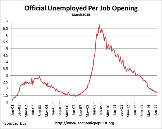
If one takes the U-6 broader measure of unemployment that includes people who are forced into part-time work and the marginally attached, the ratio is 3.5 people needing a job to each actual job opening. In December 2007 this ratio was 3.2. So here too we're finally seeing some good ratios regarding job openings.

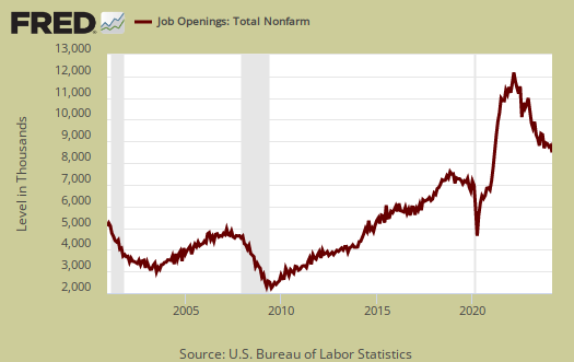
By either measure it is clear job openings have finally returned to pre-recession levels. Yet population increases, so having raw numbers come up to levels from eight years ago and so many stopped looking for work belies the level and ratios. Currently job openings stand at 4,994,000.
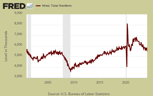
Below is the graph of actual hires, currently 5,067,000. Since the June 2009 trough, actual hires per month have increased 39%, which is a much better increase of recent. Recession hiring really didn't cliff dive like layoffs, firings and openings did, Again, the levels of working population have increased significantly since 2007. Additionally, Businesses can say there have job openings, but if they do not hire an American and fill it, that doesn't help much. The tech industry especially it notorious to put out false job ads while they offshore outsource and import foreign labor instead.
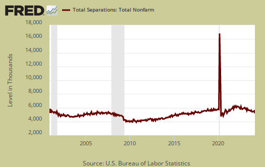
Graphed below are total job separations, currently at 4.983 million. The term separation means you're out of a job through a firing, layoff, quitting or retirement and is also called turnover. One might also notice separations have been increasing and are as close to opening levels.
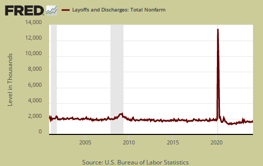
Layoffs and firings were 1.793 million, a 7.5% monthly uptick. Below is a graph of just layoffs and firings. One can see from labor flows businesses are not thrashing their workforce as much, relatively speaking. Labor flows means the way people are hired, stay at a job, quit, get fired, get another job and so on. It is the overall flow of the labor market for as people are get jobs, they also lose them.
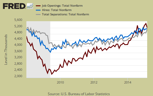
Graphed below are openings, separations and hires levels, so we can compare the types of labor flows. While layoffs have declined to pre-recession levels, it is the hires (blue) that needs to increase even more. The below figures also disprove a labor shortage since one would have more job openings than the unemployed.
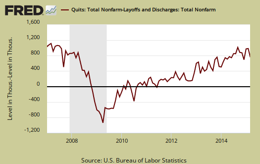
Graphed below are people who quit their jobs minus those who were fired and laid off. The lower the bar on the below graph, the worse labor conditions are. Quits are what they sound like, workers quit their current jobs often to obtain better ones. People feeling free enough to leave their current positions is considered a positive labor market sign. Quits were 2.783 million. Private sector quit statistics are now l.7% below the November pre-recession level.
Below is a graph of the quits to layoffs ratio, currently at 1.6. This ratio of people who quit their jobs vs. those who were fired gives an indicator of worker churn as well as if there might be a shortage. If the ratio is below 1.0, this means more people are being laid off and fired than people who quit. When the ratio is much higher, this means more people quit their jobs and thus implies there is better opportunity elsewhere and workers feel free enough to move on to obtain those new better jobs. The quits to fires ratio was 1.9 in 2006.

For the year, there was a gain of three million employed. Bear in mind employment duration in so called permanent jobs these days is very low, so due to labor flows the net gain of jobs over time belies the monthly headline buzz of jobs gained. From the JOLTS report:
Over the 12 months ending in March 2015, hires totaled 59.7 million and separations totaled 56.7 million, yielding a net employment gain of 3.0 million. These totals include workers who may have been hired and separated more than once during the year.
ONe of the more telling graphs created by the BLS is the detail of quits to layoff ratios for selected industries. Notice how healthcare can quit their jobs no problem, yet manufacturing and assuredly those in construction are still getting laid off. Looking at the industry detail does matter as pre-recession good paying jobs have been replaced with low paying restaurant and health care aid jobs.
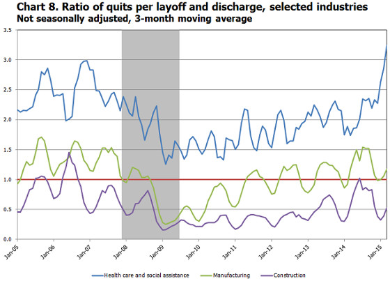
The bottom line is the situation is really getting back to before the great recession. The hidden element in these statistics is how long it has taken to return to 2007 levels. Another factor is the random culling of the labor force along the way. Remember population growth, including working age population has growth considerably since 2007. Finally, 2007 wasn't exactly the year of the worker, although 2000 might be said to be that year.
For the JOLTS report, the BLS creates some fairly useful graphs beyond the above and they have oodles of additional information in their databases, broken down by occupational area. That said, one doesn't know if the openings are quality jobs from the JOLTS statistics.
The JOLTS takes a random sampling of 16,000 businesses and derives their numbers from that. The survey also uses the CES, or current employment statistics, not the household survey as their base benchmark, although ratios are coming from the household survey, which gives the tally of unemployed.
The March 2015 unemployment rate was 5.5%. U-6 alternative unemployment rate was 10.9%. JOLTS includes part-time jobs and does not make a distinction between part-time, full-time openings. A job opening reported to the survey could literally be take out the trash twice a week and be counted. This is a shame, it would be nice to know a little more about the quality of these new opportunities. Here are our past JOLTS overviews, unrevised.

Recent comments