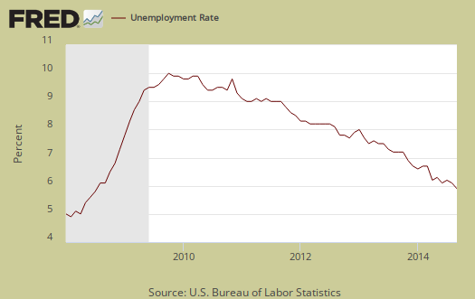
The September current population survey unemployment report dropped to 5.9% and all sing hallelujah the job crisis is over. The unemployment rate hasn't been this low since July 2008. The unemployment rate dropped two tenths of a percentage point in a month, but why it dropped is more interesting. The main reason is the decline in those participating in the jobs market. The labor participation rate is the lowest rate in 36 years, not seen snce February 1978. The ranks of the employed has increased 2.3 million in the last year while those not in the labor force has swelled by almost 2 million.
This article overviews and graphs the statistics from the Employment report Household Survey also known as CPS. This survey tells us about people employed, not employed, looking for work and not counted at all. The household survey has large swings on a monthly basis as well as a large margin of error. Yet, it is our only real insight into what the overall population is doing for work, or not.
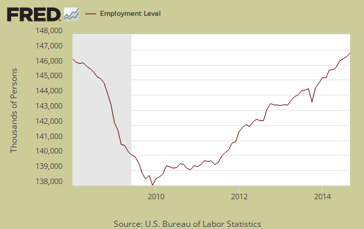
The ranks of the employed increased by 232 thousand this month which is a great showing. From a year ago, the employed has increased by 2.33 million and now tallies 146,600,000 as shown in the below graph. These figures are good signs people really are getting jobs.
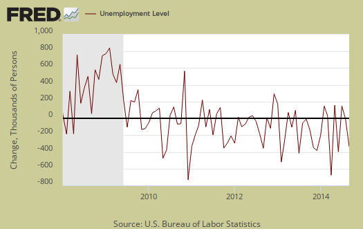
Those unemployed stands at 9,262,000 a -329,000 decline from last month. Below is the change in unemployed and as we can see, this number normally swings wildly on a month to month basis generally.
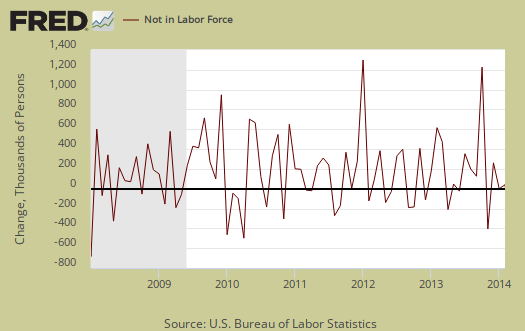
Those not in the labor force increased by 315,000 persons. The below graph is the monthly change of the not in the labor force ranks. Notice the increasing swells and wild monthly swings. Those not in the labor force has increased 1.9 million in the past year.
The most frightening statistic of the household survey is the labor participation rate. The labor participation rate is at 62.7%, a record low, and is shown in the below graph.

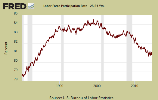
These are not all baby boomers and people entering into retirement. Below is a graph of the labor participation rate for those between the ages of 25 to 54. These are the prime working years, so once cannot blame retirement and college on the declining participation rate. As we can see, this 80.7% rate has dropped and is at lows not seen since the 1980's recession.
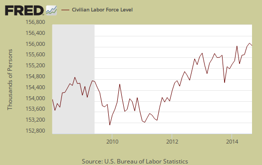
The civilian labor force, which consists of the employed and the officially unemployed, decreased by-97 thousand this month. The civilian labor force has increased by 389,000 over the past year. This shows a fairy static situation for we know new workers enter the labor force every day from increased population growth. Therefore we have a large segment of the population exiting the U.S. labor market.
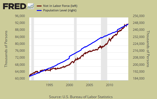
In spite of wild statistical swings, those not in the labor force grows faster than the population which has the potential to work. Below is a graph of those not in the labor force, (maroon, scale on the left), against the noninstitutional civilian population (blue, scale on the right). Notice how those not in the labor force crosses the noninstitutional civilian population in growth and the accelerated growth started happening right in 2008. There were not enough babies born starting in 1943 to explain the steep 2008 and beyond increase.
Below is a graph of the civilian labor force, or the official employed plus unemployed, in maroon, scale on left, against those not in the labor force, in blue, scale on right. Notice how those not in the labor force as a trend exceeded those considered employed and unemployed starting around mid 2009. What we have seen is a never ending growing segment of the population that is considered neither employed or unemployed, i.e. not in the labor force, increasing, above the trend line of those who would be naturally dropping out, such as the retired and those in school. Not in the labor force figures do include retirees and the size of the population greater than age 65 has grown.

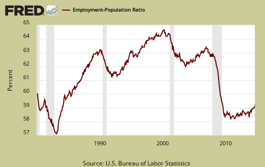
Those considered employed as a ratio to the total Civilian noninstitutional population had no change and stand at 59%. For the interested, there is a relationship between the employment-population ratio and the labor participation rate (LPR): employment-population ratio = LPR * (1 - unemployment rate).
There are millions of people who need full-time jobs with benefits who can't get decent career oriented positions. Those forced into part time work is now 7,103,000, an decrease of -174,000 from last month. Those stuck in part-time hours has declined by -811 thousand from a year ago. The below graph shows levels of people who could only get part time hours have remained elevated since the recession and these are all people who want full-time, they just cannot get it, it is not by choice, although a -10.2% drop in a year is a positive step in the right direction.

There are two categories of those working part-time hours. Those who could only get part-time jobs and those working who got their hours cut due to businesses not having enough work for them. The number of people who could only get part-time work just isn't budging and decreased by -25 thousand to 2,562,000. The number of people who could only find part-time work is shown in the below graph and from a year ago has grown by 14,000.
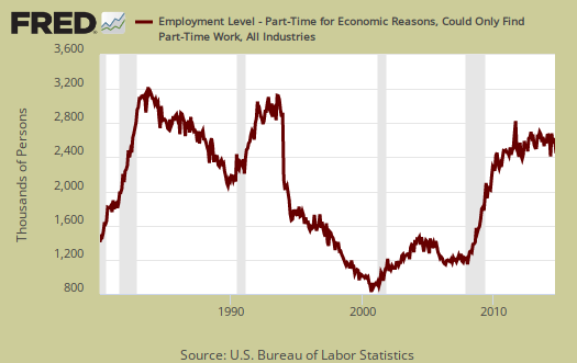
People can also be stuck with part-time hours due to slack working conditions. This figure has remained just obscenely high for years now and this month is 4,162,000 From a year ago those who are getting their hours slashed due to weak economic demand has declined by -16%,or -781 thousand Below is a graph of forced into part-time work because they got their hours cut, as a percentage of the total employed. Part-time work due to cut hours is known as slack work conditions. Slack working conditions causing part-time hours remaining high or increasing implies economic conditions have not improved enough, that there still is just not enough demand in the economy for businesses to run full steam. Below is a graph of forced part-timers due to slack work conditions as a percentage of the civilian labor force. This is a recession economic indicator, notice the line slope matches strongly the gray recession bars of the graph. In other words, part-time work due to a crappy economy has clearly improved over the last year.

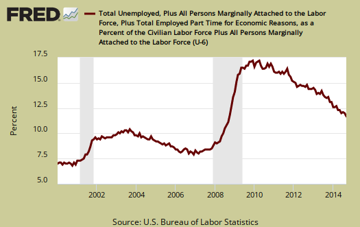
U-6 is a broader measure of unemployment and includes the official unemployed, people working part-time hours because that's all they can get and a subgroup not counted in the labor force but are available for work and looked in the last 12 months . The U-6 alternative unemployment rate still leaves out some people wanting a job who are not considered part of the labor force. U-6 stands at 11.8%.
The long term unemployed, or those unemployed for 27 weeks and over, has dramatically declined and now stands at 2,954,000 people. The long term unemployed are the crisis of our time and we know these people did not get jobs since the ranks of the employed gained less than the decline in the long term unemployed. From a year ago the long term unemployed ranks have decreased by -28.4%, but this does not mean at all these 1.171 million folk found work.

The marginally attached are people not in the labor force because they have not looked for a job in the last month, but have looked for a job in the last year. This number has ballooned since 2007 and not returned to pre-recession levels. The graph below is the number of people considered marginally attached to the labor force, currently at 2,226 million. The marginally attached should only be viewed as a long term trend for the figures are also not seasonally adjusted.
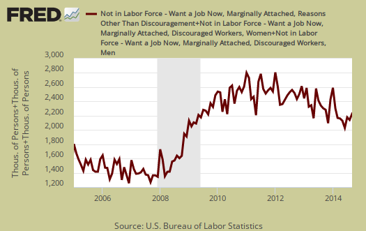
Discouraged workers are people, not counted as part of the civilian labor force, who not only want a job, but also looked for one in the last year. These people aren't job hunting now because they believe there are no jobs out there. Below is the graph of discouraged workers, currently at 698 ,000 people and are a subset of the marginally attached. Discouraged workers is kind of a barometer for how the job market is perceived. From a year ago workers discouraged has declined by 18.1%. In other words this figure has budged, implying the job market has finally improved.

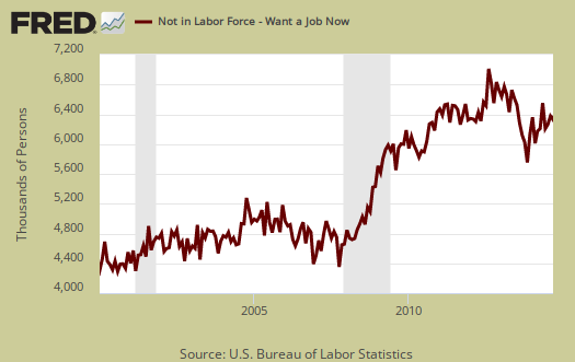
Our favorite statistic from the CPS survey is how many people who are considered not in the labor force, report they want a job now. It is a direct survey question from the CPS. The survey asks people who are not being counted in the unemployment statistics and official unemployment rate if they want a job. The number who answer yes currently stands at 6,349,000, a very large number of people. Those who are not counted yet report they want a job includes the discouraged workers and marginally attached and is seasonally adjusted. This figure has increased by 231 thousand or 3.8% from a year ago. If the job market was really that great, this figure should drop along with the unemployment rate.
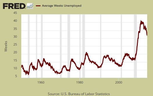
The average length of unemployment is 31.5 weeks and a year ago was 36.8 weeks. The average duration is still very high even after dropping over a month in the last year.
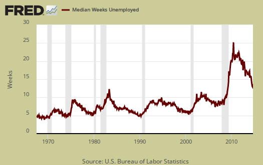
The median time one is unemployed, which means 50% of people have gotten a job in this amount of time is 13.3 weeks. This is over four months to be without a paycheck as the median, and even after that length of time 50% of the people still can't find work.
Those unemployed less than five weeks declined by -226 thousand from last month and stands at 2,383,000. Those unemployed between five weeks and 14 weeks is 2,508,000 and people who had been unemployed for 14 weeks to 26 weeks was 1,416,000. The long term unemployed is 2,954,000 and is 31.9% of the total official unemployed. A drop in the unemployed does not necessarily mean they found a job.
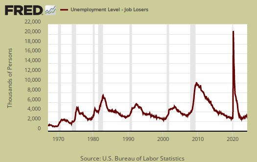
The household survey gives the reason for new unemployment status. Job losers and those who completed temporary jobs dropped by -316,000 and stands at 4,530 ,000. Below is a graph of job losers by levels. While the figure has dropped dramatically it is still higher than any other recession. In other words people are still losing their jobs as a pattern in comparison to before 2008.
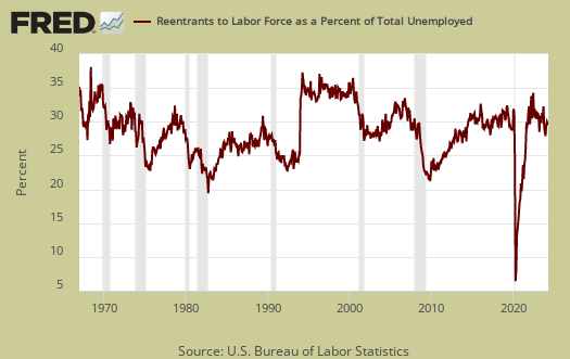
People join the ranks of the unemployed because they were laid-off, fired, they quit, the job was temporary and thus ended, they entered the labor force for the first time and re-entrants. Re-entrants are people with work experience, yet have been considered not in the labor force for some time. Recall to be considered unemployed one has to be actively searching for a job or expecting to be recalled and on temporary layoff. Re-entrants decreased by -36 thousand people this month. Below are re-entrants as a percentage of the total unemployed. As you can see, as jobs and opportunities appear, people re-enter the labor force looking to snap one of those jobs. If there were really a lot of job opportunities out there, the slope of this graph would spike up and should spike up to the extremes since there are so many who have stopped looking, are not counted as unemployed currently, who could re-enter the labor market.
Re-entrant unemployed levels, graphed below, are yet another sign on how people are not finding work, giving up, then dropping out of the labor force and then trying again to get a job. If the job market was good for a long period we'd see this statistic drop as new entrants would have found work instead of being once again officially counted as unemployed.

This month's household survey, makes it seems like the job market is perfectly fine. Yet if we look at labor participation rates, that is the reason the unemployment rate has dropped so much. It is also true the job market has improved and more people are finding work.
Here is our past overviews CPS unemployment statistics.

Today's headlines (seasonally adjusted)
The ranks of the "employed" has increased by 2.3 million in the last year while those "not in the labor force" has swelled by almost 2 million.
Does this mean we only had a NET GAIN of 300,000 in the labor force over the past year?
B.S. from Bloomberg
Bloomberg: Drop in U.S. Labor Force Hard to Pin on Discouraged Workers
http://www.bloomberg.com/news/2014-10-03/drop-in-u-s-labor-force-difficu...
"The retirement of baby boomers or people deciding to leave work to start families or go back to school, are more likely behind the continued exodus that is helping drive down unemployment."
Start Families?
Business Insider: May 7, 2014 - Marriage Rates Are Near Their Lowest Levels In History
http://www.businessinsider.com/causes-of-low-marriage-rates-2014-5#ixzz3...
CNN Money: July 20, 2014 - Millennials say no to marriage
http://money.cnn.com/2014/07/20/news/economy/millennials-marriage/
If not getting married, are they choosing to co-habitate and raise children outside the institution of marriage? Are people choosing to leave the work force to have children with no income or employer heathcare plans? Are masses of people deciding NOT to work to go on welfare and Medicaid to have and raise children outside of marriage — "to start families"?
Retires and College students? (They left out "those on disability", but they only make up a tiny fraction anyway.)
Every year since 2008, high school grads have out numbered retirees (Baby Boomers) by 3 million to 1 million. That would be 7 million retirees (Baby Boomers) who left the work force since 2008 compared to 21 million high grads we had during that time. For the sake of argument, say 7 million high school grads left the labor force (or never entered) to "go back to school". That would still leave 14 million high school grads that either found a job and/or slept on their parent's couch, or married into money (or who otherwise, found someone to support them.)
Source?
Bud, how are you measuring retirees and HS graduates?
Civilian Labor Force is the "Labor Market" Potential
The civilian labor force is the employed and unemployed, official. Those not in the labor force includes retirees, disabled, college students, stay at home domestic partners and so on. Those not in the labor force also includes people who have given up and thus are now longer counted. Those not in the labor force is a superset of the number of people who have given up.
i.e. not in the labor force does not equal unemployed.
labor force computation
bud, the labor force is simply an addtion of the employed and unemployed; not in the labor force is everyone else over 16, including those who didnt look for in the 30 days prior to the survey...the over 16 population increases about 200,000 to 220,000 each month...you can see how these numbers add up here: http://www.bls.gov/news.release/empsit.a.htm
rjs
What am I not seeing?
Sept 92,584 Not in labor force
Aug 92,269 Not in labor force
315,000 more "not in labor force"
232 jobs created from month before
+315 not in labor force from month before
=547,000 ("The over 16 population increases about 200,000 to 220,000 each month)
-220,000 (* 220,000 babies born = 220,000 high school grads looking for work or going to college)
=327,000 (* So who are these people, what are they doing, and where did they go?)
see this article
I have no idea what you are doing, for these figures add monthly and are labor economics concepts.
See this post.
Labor flows mean people move from different subsets of employed, unemployed, not in labor force and flows of course would not add up on overall population additions of birth/death/immigration.
There are 'missing people' but this isn't right I believe EPI did a recent new estimate. 6.3 million!
Their analysis is here and they are worth following on how they calculate and arrive at missing 6,320,000 workers.
This is the best summary of
This is the best summary of the monthly numbers I've seen this week. EPI is my other 'go to' for solid jobs data.
Thank you
Glad to see this useful, it's a lot of information and I've been wondering how to modify and shorten, just to focus in on a couple of elements in the release.
Different scales
Overall, this summary is good. However, your use of different scales on the same plot leads a nonsensical statement in at least one case. You say: "Below is a graph of those not in the labor force, (maroon, scale on the left), against the noninstitutional civilian population (blue, scale on the right). Notice how those not in the labor force crosses the noninstitutional civilian population in growth ...". But the two scales differ by almost a factor of three! To speak of how one curve "crosses" the other is meaningless, since neither plot has an origin of zero AND they have different scales. The relative rate of growth those not in the labor force (as a percentage of those previously not in the labor force) is increasing faster than the size of the noninstitutional civilian population, but that's about as much as you can say with the plot you are referring to.
scales to show slope
The reason for that graph is to show the rate of change, or slope. The rate of change is greater and why it does cross. Maybe I should simply create a differential graph showing the rate of change on the same scale so it is realized the point.
Good point
I've just recently realized that dual-axis FRED charts can be highly distorted by different scales. One dataset is stretched up to meet the height of the other, creating a false correlation. Is there any way to remedy that in FRED or do I need to use a different program/site? I guess I could avoid dual-axis charts and use index charts, etc. I would also like the ability to zoom out to show zero but FRED doesn't seem to have that capability.
dual axis FRED charts
I'm using FRED because that is what the original template is for this article. I have "predefined" calls into the old FRED that they broke, then removed some of the breakage.
But, unfortunately, they went to graphing which is more like a toy, so the only way I know to get correct to scale graphs is to make them yourself in LibreCalc or Excel or Matlab, Octave, etc.
At least you are aware enough to comment! I know this is a huge problem and am looking for a solution. There is some new on the flash graphing code, HTML5 results open source and I was going to run a test case. So far,there just isnt a fast way to create correct, fast loading, readable graphs that I'm aware of.
Good eye you have!
Declining participation rate
Although the unemployment rate has declined significantly, it is not something to be too proud of as the participation rate in the labour force has also declined. according to the statistics shown, the participation rate is at a low 62.7%. What is more alarming is that, of that percentage, 80.7% are people between the ages of 25 and 54 (prime working years) who are not participating. Therefore, the concern should rather be on why these people are not seeking jobs. My question is, is the decline in the unemployment rate a true reflection on the availablity of jobs and most importantly, people actually applying and taking those jobs?
Unemployment
This article is pertinent to me as a South African student studying Economics. We experience an unemployment rate of roughly 25 % percent according to the strict definition and this rate is excluding those not searching for employment. There is a firm belief that this high unemployment rate can be attributed to the lack of an established formal sector in South Africa in the way that such sectors exist in developing countries such as India and Brazil. How much of a role do informal business sectors play in improving employment rates in developed countries such as America? and how are such sectors established if their role is of significance in these developed countries.