
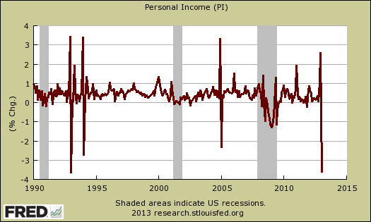
The January personal income and outlays report is horrific. Personal Income nose dived -3.6% from December and hasn't seen this big of a monthly drop since January 1993. That's 20 years ago. The blame is being laid on the payroll tax holiday expiration and December did see a rise in personal income also not seen since December 2004. Disposable income is worse. DPI dropped -4.0%, even when adjusted for inflation. The below graph shows the monthly percentage change of personal income going back to 1990. Ouch!
Consumer spending increased 0.2% from last month, and when adjusted for inflation was a 0.1% increase, the same as December. Consumer spending is another term for personal consumption expenditures or PCE. Real personal consumption expenditures are hugely important to economic growth as consumer spending is about 71% of GDP. Real means adjusted for inflation.
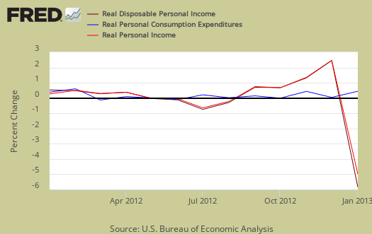
Graphed below are the monthly changes for real personal income (bright red), real disposable income (maroon) and real consumer spending (blue). Personal income plunged -3.6%, dispoable income cliff dove -4.0%. When adjusted for inflation, actual disposable income decreased -4.0%. Take away inflation and government payments, personal income decreased -4.5% (see further below). This should negatively impact consumer spending going forward. One cannot have a monthly drop of -4.0% in real disposable income and expect strapped Americans to spend more.
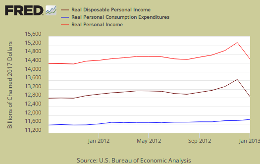
Below are the real dollar amounts for real personal income (bright red), real disposable income (maroon) and real consumer spending (blue). Notice by levels how much lower real disposable income is now.
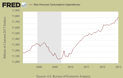
Consumer spending encompasses things like housing, health care, food and gas in addition to cars and smartphones. In other words, most of PCE is most about paying for basic living necessities. Graphed below is the overall real PCE monthly percentage change. January is the first month for Q1, so the real PCE flat line doesn't bode well as a first sign of Q1 economic growth.

What people spent money on, adjusted for prices, or in real dollars, by monthly percentage change was:
- durable goods: –1.8%
- non-durable goods: +0.3%
- services: +0.3%
Health care, for example, is a service. Gasoline is a nondurable good. Cars are a durable good and January's decline was due to less purchases of motor vehicles & parts. When people are cutting back on their spending, durable goods are usually the first things to go, especially large ticket items.
Price indexes are used as divisors to adjust for inflation and price changes. The indexes are used to compute spending and income for an apples to apples, real dollar comparison to previous months and years. Economic statisticians use real dollars so one does not erroneously assume economic growth when it's really inflation.
The PCE price index is used to remove inflation from consumer spending and income, reported above. The price index was essentially 0%, for January and is up 1.2% from a year ago. Energy alone decreased -1.9% has increased 0.1% from a year ago. Don't expect this to last as gas prices are skyrocketing. Minus energy and food, the price index increased 0.1% and is up 1.4% from this time last year. While the PCE price index represents inflation, it is different from CPI. Food prices had no change for January.
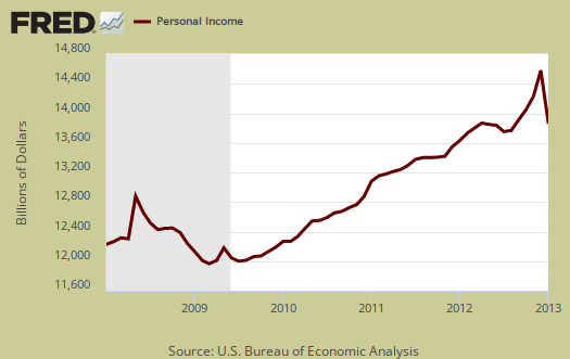
Personal income is the total for everybody in the United States who is reported and not part of the underground economy. Below is personal income, not adjusted for inflation, or price changes. Notice the plunge.
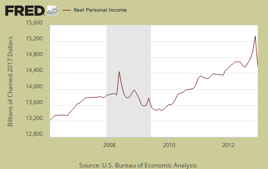
Real personal income, or personal income adjusted for inflation, via the PCE price index, and also has government payments, such as social security, removed, decreased -4.5%. Below is the graph of real personal income.
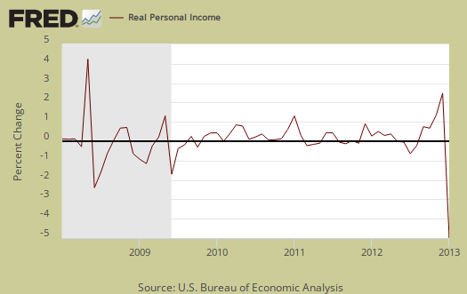
Why the BEA report doesn't give real personal income monthly changes including transfer receipts, instead of excluding them, I do not know. Below is the monthly percentage change in real personal income, or adjusted for inflation and excluding payments from the government.
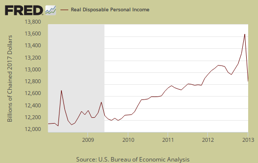
Disposable income is what is left over after taxes. DPI (disposable income), plunged -4.0% from last month. DPI adjusted for inflation (see the price indexes above), decreased -4.0%, from the previous month. These numbers are aggregates, which includes income of the uber-rich, or the 1% of the population, as they are now called. Below is DPI by levels and we can see this month's drop set the U.S. back to April 2012 levels.
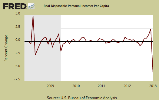
Below is real disposable income per capita. Per capita means evenly distributed per person and population increases every month. January mid-month the U.S. population was 315,162,000, in increase of 598,000 from last month. As aggregate personal income increases, so does the population to earn that income. When taking increased population into account, we basically have no growth in real disposable personal income and this is over years.
The monthly percentage change for wages and salaries was –0.6% and total compensation, which includes wages, salaries, dropped -0.4%. Landlords just keep making out like bandits, rental income increased 2.3% and every month rental income increases above 1.0%. Proprietor's total income, with inventory valuation and capital consumption adjustments, increased 0.5%.
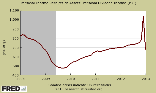
Personal receipts, income on assets, plunged by –17.8%. This is income from non-incorporated businesses, such as the self-employed. Dividend income, part of income on assets cliff dove –34.8% for the month, interest income, –0.3%. The plunge in assets is due to accelerated reporting and changes in the tax rates. In other words, the fiscal cliff deal to raise income taxes is what affected these monthly percentage changes. From the BEA:
The level of personal dividend income was reduced $81.0 billion in January (at an annual rate), after a boost of $291.0 billion in December, reflecting accelerated and special dividend distributions paid in December; these adjustments reflected the impact of expected changes to individual income tax rates.
Below is a graph of dividend income on assets.
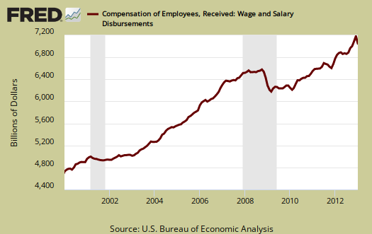
Graphed below are wages and salaries for the past decade. Notice the dip and the more flat line than earlier in the decade. Bear in mind these are aggregate, or all wages and salaries, and not adjusted for inflation.
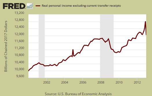
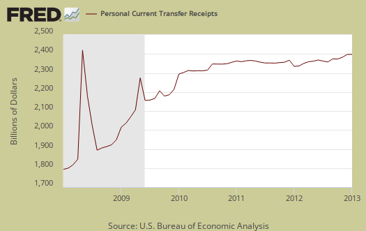
Below is adjusted for inflation personal income minus personal current transfer receipts. This graph shows how much personal income increased that wasn't funded by the government and is used as a recession indicator as show in the below graph with the gray bars indicating recessions. Transfer receipts are payments from the government to individuals where no actual services (work) was performed. This includes social security, unemployment insurance, welfare, veterans benefits, Medicaid, Medicare and so on.
Transfer receipts monthly change was 0.3%, not adjusted for inflation. Below is a graph of just transfer receipts. January is when cost of living increases take effect, yet what "recalculation" was done is unknown.
Personal current transfer receipts increased $7.0 billion in January, compared with an increase of $20.7 billion in December. The January estimates of current transfer receipts reflected 1.7-percent cost-of-living adjustments to social security benefits and to several other federal transfer payment programs; together, these changes added $15.2 billion to the January increase. The January change in social security benefits to persons was reduced by lump-sum payments, which had added $7.0 billion to December; these benefit payments resulted from a recalculation of the earnings base underlying the benefits for recent retirees.
Personal savings is disposable income minus outlays, or consumption and not adjusted for inflation. The Personal Savings Rate was 2.4% in January, clearly hammered by the decline in DPI.

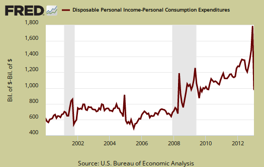
Below is disposable personal income minus personal consumption expenditures monthly raw total changes. When we see this spike we know people are not spending in relationship to the income they have available, alternately, they don't have enough income available on the downside.
Personal Outlays means what goes out of your pocket and thus into the economy. Personal outlays are PCE, personal interest payments, and personal current transfer payments. PCE is defined above by percentages is almost all of personal outlays. Personal interest payments are things like the interest you pay on your credit card. Personal transfer payments are defined as:
Payments consisting of transfer payments by persons to government and to the rest of the world. Payments to government include donations, fees, and fines paid to Federal, state, and local governments, formerly classified as "personal nontax payments."
In other words, personal transfer payments are nothing more than that speeding ticket you just got or how you just donated to this site. People often confuse transfer payments with transfer receipts, not the same thing.
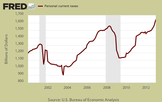
Taxes collected on person income decreased but it appears the reason was an accelerated estimate in December assuming no deal on the fiscal cliff happened. Thanks Congress. From the BEA report:
Personal current taxes decreased $14.0 billion in January, in contrast to an increase of $27.6 billion in December. The January change reflected additional taxes paid on accelerated income distributions in December. Payments of final settlements and back taxes less refunds in Federal net nonwithheld income taxes reduced the January change by $3.4 billion, based on the Office of Tax Analysis projections. Indexation provisions of current tax law reduced federal withheld income taxes by $1.4 billion in January.
Below is a graph of personal income taxes. Here we can see the effect of the Bush tax cuts as well as the recession (no income, no taxes on that income), as well as the temporary tax breaks from the Stimulus.
Finally, here is the biggest reason for January's income plunge, expiration of the payroll tax holiday. Payroll taxes on the employee side are for social security and were temporarily reduced as a stimulative tax cut and were allowed to expire as part of the fiscal cliff deal in December. As a result, these contributions to social security and Medicare, taken out of your paycheck, increased 13.1% as a monthly percentage change. Even though workers are paying into retirement benefits, they are perceived as taxes and subtracted from income.
Contributions for government social insurance -- a subtraction in calculating personal income -- increased $126.7 billion in January, compared with an increase of $6.3 billion in December. The January estimate reflected increases in both employer and employee contributions for government social insurance. The January estimate of employee contributions for government social insurance reflected the expiration of the “payroll tax holiday,” that increased the social security contribution rate for employees and self-employed workers by 2.0 percentage points, or $114.1 billion at an annual rate.
Below is a graph of this increase and we can see the temporarily payroll tax holiday and it's expiration. We also got hit with Obamacare and a Medicare premium increase.
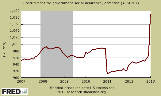
Next time you hear social security is running out of money, take note of the $132.8 billion just collected. From the BEA:
The January estimate of employee contributions for government social insurance also reflected an increase in the monthly premiums paid by participants in the supplementary medical insurance program, in the hospital insurance provisions of the Patient Protection and Affordable Care Act, and in the social security taxable wage base; together, these changes added $12.8 billion to January. As noted above, employer contributions were boosted $5.9 billion in January, so the total contribution of special factors to the January change in contributions for government social insurance was $132.8 billion.
To visualize more data from this report, consider playing around with more of the St. Louis Federal Reserve Fred graphs. Here are our overviews of personal income & outlays and overviews of GDP are here. This overview details the BEA Personal Income and Outlays statical release, which covers individual income, consumption and savings. The personal income & outlays report is annualized and seasonally adjusted, although most percentages are presented as monthly rates.
Recent comments