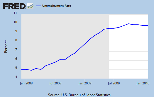
The February 2010 Unemployment figures came in at 9.7% Unemployment rate, a U6 of 16.8% and 36,000 more jobs lost.
Upon first glance the unemployment rate looks like it is on the pause button.

Below is the nonfarm payroll, seasonally adjusted:

You can see the total number of jobs is kind of rolling around at the bottom. Here is the net change, per month:

There is a lot of chatter about the weather, but no one knows how and if it affected this month's rate, it could have added some workers, helping with weather or subtracted.
I must take note right now, another thing that must be on auto pilot is Congress, the media and even some blogs. Far and wide the headlines read how this is really good and even Harry Reid said this on the Senate floor. Uh, no, this is not good! Good would be 200,000 jobs added to the nonfarm payroll. Good would be anything about 100,000 jobs added to the nonfarm payroll. It's pretty clear many out there are trying to make less bad the new good. Uh, no, good is not on a relative scale, it's an absolute folks. We need anywhere from 85,000 to 145,000 jobs created each month just to keep up with the population rate. That's reality.
Here is last month's report and notice we lost 10,000 more jobs this month, seasonally adjusted (which takes into account the differences in days per month). January nonfarm payroll was revised to -26,000, from -20,000 and December had a major revision upwards, from -150,000 to -109,000.
While geeks are always ignored, you might look at this graph on total information services jobs since 2000.

Next time you hear the claim there is a shortage of technical workers, use this graph! That is pure fiction obviously and a major labor arbitrage agenda, most notably by our offshore outsourcing industry. This month the information industry dropped 18,000 more jobs.
Also note the DOL does not differentiate between a foreign guest worker or even an illegal immigrant in their data. So, of the above, one cannot tell if that I.T. worker is on a H-1B, L-1 guest worker Visa or is an U.S. worker. Talk about data distortions, this has to be a major one, completely ignored!
Long Term Unemployed
40% of those counted as unemployed have been so for 27 weeks or longer. Forced part time increased to 8.8 million from 8.3 million.

While not much has changed on the participation rate, 64.8%, or the employment to population ratio, 58.5%, see these graphs for the dramatic overall declines.


Subject Meta:
Forum Categories:
| Attachment | Size |
|---|---|
| 225.81 KB |

Ritholtz did a graph-o-rama post, with more insightful graphs
employment chart roundup.
It has things like the intent to hire (negative!), the increase in the infamous "we're all temps now" motif, and assuredly the one you've seen Calculated Risk do, which is compare this to past recessions (way worse!).
Very nice eye candy to check out. (EconomPic Data is the ultimate graph eye candy).
Just to make sure both are read
Don't miss out on midtowng's long term unemployed, falling off of the count graphs too.
Man, how can anyone in their right mind say this is good?
Welcome to Socialism,
Welcome to Socialism, America.