
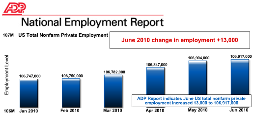
The June 2010 ADP private employment report is out with a paltry 13,000 job increase. The ADP reports on private sector jobs, no government, or federal jobs are counted. The ADP reports excludes temporary Census jobs, which are government jobs.
What's even more ominous, ADP suggests we have an drop off on job creation.
Recent ADP Report data suggest that, following steady improvement through April, private employment may have decelerated heading into the summer. The slow pace of improvement from February through June is consistent with other publicly available data, including a pause in the decline of initial unemployment claims that occurred during the winter months.
Below is the by sector breakdown of the report. The sector that would create good wage jobs, the good producing sector, is going the wrong direction. It declined -17,000 in June. Construction is still losing jobs, this month 35,000, and so is the financial services sector, -10,000.
June’s ADP Report estimates nonfarm private employment in the service-providing sector rose by 30,000. Employment in the goods-producing sector declined 17,000 during June while employment in the manufacturing sector increased 16,000, the fifth consecutive monthly increase.
Large businesses, defined as those with 500 or more workers, saw employment increase by 3,000 and employment among medium-size businesses, defined as those with between 50 and 499 workers increased by 11,000. Employment among small-size businesses, defined as those with fewer than 50 workers, decreased by 1,000 in June.*
In June, construction employment dropped 35,000. This was the smallest decline since July, 2008. This drop marks 3 years of monthly decline, and brings the total decline in construction jobs since the peak in January 2007 to 2,226,000. Employment in the financial services sector dropped 10,000, resulting in over three years of consecutive monthly decline.
According to ADP, the average job creation for the last 5 months was 34,000 per month. It takes (including government jobs) at least 200,000 (lowest estimate 150,000) jobs per month just to keep up with workforce population growth.
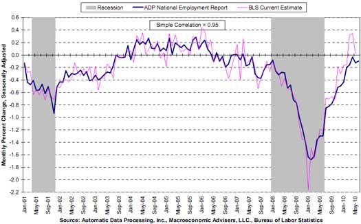
I want to show the below chart, taken from the ADP report. The below shows the percentage change of job creation each month. While the U.S. population and workforce population increase each month, for an entire decade we have anemic job growth. Notice there isn't a blow out job growth month for an entire decade. If this isn't a hint there is something very structurally wrong with the U.S. economy, I don't know what is.
ADP and BLS contradictions
Over at Bonddad, NDD writes the following:
“The ADP has had a horrible record predicting the Nonfarm Payrolls number of jobs for the last year and a half. Here's a list of how the ADP number (1st column) has compared with Nonfarm Payrolls non-government jobs number (2nd column) and the Household Employment Survey (3rd column) so far this year (all figures in thousands):
Jan. -22 +16 +541
Feb. -20 +62 +308
Mar. -23 +158 +264
Apr. +32 +218 +550
May +55 +41 -35
June +13 ? ?
That's nearly a 100,000 average difference between the ADP and BLS reports.”
I in turn wrote to him:
On another blog, there is “a chart taken from the ADP report showing the percentage of change of job creation each month” has a “sample correlation = 0.95” between ADP and BLS estimates.
Would you care to comment?”
RO,
Would you care to help clarify what seems to me to be a contradiction or should we just chalk it up to “Lies, Damn Lies and Statistics?
ADP vs. BLS, I'd have to go into it deep
to really see the differences, i.e. pull in the XLS from both and chart them, but that said, every month I pour over the BLS statistics and clearly there is no real job creation! So, the fact that the ADP report sometimes can deviate from the BLS, and I do recall there being more deviation recently than in the past, bottom line is both say, there ain't job damn jobs.
From the chart you can see some of the deviation and also on their website is more charting capability, but that said, uh, do you see any damn jobs in there? Either one?
Tomorrow the BLS report will be out so I want to focus on putting the magnifier on that one as best I can.
But someone trying to claim that a 5% deviation or even 10% somehow means there are jobs around ....uh, not so from either report.
additional ADP tomorrow
I'm try to make a point of graphing the private sector from the BLS and then compare ADP as a side note.
I think tomorrow's numbers are going to be bad, forget the census jobs issue, the underlying report is going to be bad. I could be wrong and employment is a lagging indicator but after writing up a series of other reports today, I fear our "Doom & Gloom" position (EP has be labeled a bunch of Wendy whiner doom & gloomers) is going be validated. We'll see.