
The Federal Reserve is publishing a 1.2% increase from last month in in industrial production Here is a detailed report.

The main cause for the increase was a spike in utilities, caused by hotter weather. The breakdown in industrial production was:
- manufacturing: +0.9%
- mining: -0.2%
- utilities: +4.8%
Capacity growth is -1.3% for the year and in manufacturing, -1.5%. For the month overall capacity increased 1.0%. This means the actual amount of potential facilities and ways to make stuff has dropped. Think closed factories as you drive through the Midwest.

For industrial production the marketing group major changes are:
- Final Products: +1.1%
- Consumer goods: +1.2%
- Business equipment: +1.3%
- Nonindustrial supplies: +1.4%
- Construction: +0.8%
- Materials: +1.3%
The output of nearly all major market groups rose in May. The production of consumer goods increased 1.2 percent, boosted by higher output of both consumer durables and nondurables. Within consumer durables, which jumped 2.6 percent, large gains in the indexes for automotive products, home electronics, and miscellaneous goods were only slightly offset by a small loss in the index for appliances, furniture, and carpeting. The production of consumer nondurable goods moved up 0.8 percent. The output of non-energy nondurables rose 0.5 percent; all of the major categories for that index recorded increases except chemical products, which fell 1.1 percent. The output of consumer energy products moved up 1.6 percent, with gains in all of its components other than automotive gasoline, which fell sharply.
The output of business equipment rose 1.3 percent in May, a pace on par with the average monthly gain during the previous two months and somewhat above its average increase earlier in the recovery. The output of transit equipment climbed 2.5 percent following a decrease of 1.6 percent in April. The increase in May primarily resulted from higher output of trucks, which more than offset losses in civilian aircraft. Elsewhere in business equipment, the index for information processing equipment rose 0.9 percent, and the index for industrial and other equipment increased 1.2 percent. The output indexes for both of these categories have advanced substantially since last fall; gains in semiconductor manufacturing equipment and construction machinery have contributed significantly to the improvement in the industrial and other equipment category.
In May, the output of defense and space equipment moved down after four consecutive monthly increases. A strike at a producer of military cargo planes accounted for the loss.
Within nonindustrial supplies, the output of construction supplies increased 0.8 percent in May after two consecutive months of larger gains. The production of business supplies rose 1.7 percent in May, the second consecutive monthly increase after declining earlier in the year.
The output of materials to be further processed in the industrial sector increased 1.3 percent in May after having risen about 0.6 percent per month since the beginning of the year; the index in May was 9.2 percent above its year-earlier level. The production of durable materials climbed 2.0 percent, with widespread solid gains within consumer parts, equipment parts, and other durable materials. By contrast, the output of nondurable materials was unchanged in May, with a decline in chemical materials offsetting a small gain in paper materials and strong gains in both textile materials and other nondurable materials. The index for energy materials climbed 1.8 percent in May; most of its components advanced, with the notable exception of coal mining, which fell 5.9 percent.
While the report is positive, the numbers almost look suspicious. Who can believe construction supplies increased +0.8% in a month considering other construction and housing reports?
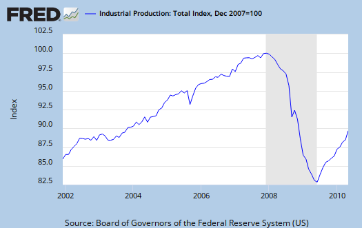
Below is a graph of industrial production on a longer time period scale. As one can see it's still way below the December 2007 (start of this recession) level.
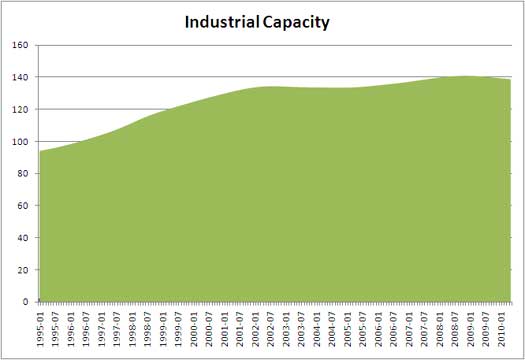
Capacity utilization was 74.7, up The below graphs show the overall decline of U.S. capacity utilization. Capacity utilization is how much can we make vs. how much are we using. These graphs show the U.S. is simply not producing what it is capable of, a reflection of the output gap.

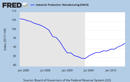
Below is the Manufacturing capacity utilization graph. The financial press will report blow outs, so it's important to compare capacity utilization to pre-recession levels.

capacity graph
We have an anonymous drive-by who always gets poed about the lack of attention paid to decreased overall capacity. Anonymous is right of course and since capacity utilization is a percentage, you're going to see an increase in percentage even though actual capacity has declined. Now we have a look see at just raw capacity numbers with the "green" graph.
Where's the raw capacity data (the green graph) from?
Hoping you could tell me where you pulled the raw Industrial Capacity figures. Was it from the St. Louis Fed like the rest of the data in this post? Would be grateful for any tips. Thank you.
raw capacity data is from the IP data on the Fed website
Industrial production. Some of the original graphs on EP, I have had to collect raw data from press releases, plus go back and check for number revisions.
Basically create my own spreadsheet and then create graphs from there. In other words, there is no Federal Reserve graph like the above, that's original, like many other graphs on EP, created from the data and then posted.
The St. Louis Federal Reserve doesn't publish all data, esp. Census data (too massive probably), but they are by far the easiest, most awesome economics tool/website out there, but they do not graph or hold data for everything, not by a long shot.
So, what I do is use their database if available and if they are not covering a particular topic, I'm running my own spreadsheets and then generate summaries, graphs from that.
I always put the links to the "home base" of the government report in these economic report overview posts. The links always go to the current release at minimum but you need to go to the DDP program from the Fed, which is a scripted database, not a statistic URL, so follow the "home base" URL for the Fed on industrial production, linked above.
On this site at least, the links are loaded with references and almost a citation.
You also need to note the major revisions and the fact no matter what you try to do, they "normalize" these numbers, i.e. baseline division by some year, so in terms of really getting to the raw, unedited, metrics is very hard.
I have raw cap, but the problem is the Fed went back and "revised" all sorts of historical numbers, then turned around and used year 2007 as a baseline.
The reason I'm graphing out raw capacity is because it dropped this recession and that is a first! To me is shows the offshore outsourcing of our manufacturing base and I honestly feel the Fed fudges or at least hides this report.
I don't find it well explained, I find inconsistencies and it bugs me. I will assume "user error" first on any data, (although I believe I'm making a hell of a lot less errors than most of the financial press and even a lot of blogs). In other words, I will assume I have made a mistake or do not understand something before I accuse any governments statistician of playing data games to hide bad news. Aggregate data for an entire nation to me is a tough job, to adjust statistically plus be accurate.
So, I personally work on it and it's only when I can make numbers match, make sense, do I post a graph from a working spreadsheet, database.
Case in point is rectifying trade data with GDP. I have the price import/export multipliers and still cannot get those two to jive, so in that case, I keep working on it but don't put it on EP, for it would be "economic data fiction". ;)
I'm putting the site URL on original graphs, so feel free to use them but cite...the site. St. Louis Fed automatically does the same thing, puts their URL on graphs and Calculated Risk, I can tell you his graphs are almost always correct, also does.
Just cite the source or don't try to remove the source URL.
consider creating an account and registering
If you're a data junkie, consider registering on the site. A host of new features are available for registered users.
Generally, graph origins are cited, although the data used in the graph is often indirected cited. Because the St. Louis Fed automatically generates a citation on their graphs themselves (or should I say your generated graph from their tools and databases), I don't include it, but I use multiple tools for original graphs on EP and all equations are created with mimeTex, which is a LaTeX port for the web.
I love eye candy, graphs because it gives such a better picture on what's going on and I'm a math head.
I sure hope folks reading this site are pickin' up on how to read, visualize, look at a graph. I try to put that kind of info into the text description.
That's a real communication problem generally. When I see a number, that number speaks to me and screams "Holy shit the economy is going down a rat hole" whereas I think to the general public, numbers are just weird little scribblings to be ignored....
They cannot fathom scale, that's one of the biggest problems I think. $221 looks the same to them as $221B.
So, one of the goals of the site is to bridge the gap so numbers scream to others what they scream to math heads all by themselves.
Anywho, sign up! We love eye candy, numbers, graphs and stats here!
I am never POed Bob - just
I am never POed Bob - just unduly hysterical. I thought no one else was marking it, but you skooled me last month. This is massive sustained industrial capital flight.
LOL
I'm just happy someone else besides myself is looking at these EI data releases enough to dig around and notice anything.
This one, well, either there is a revision later or something really seems out of alignment with other reports to me.
But, yes, I finally got a little Excel 2007 to make up some custom graphs, although getting to the data from the Fed was a hassle. (the only site who really has it together is the St. Louis Fed, most easy and awesome graphing system and online no less).
I did see some loss of capacity in early 2000, no surprise because that's where the offshore outsourcing really started, but I also saw a decrease in other periods.
Not as significant as this by a long shot.