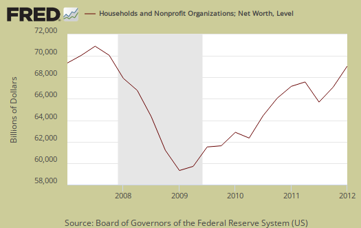
The Q1 2012 Federal Reserve's flow of funds report was released last Thursday with significant revisions. Household wealth increased $2.82 trillion to $62.87 trillion in Q1 2012. The gains were in stocks, mutual funds so the average Joe without portfolios, basically didn't see anything. Below is a graph of annual household net worth.

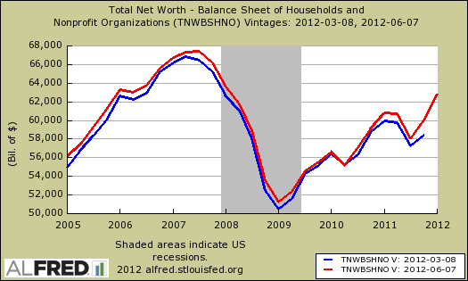
That said, the revisions are astounding. Below is a graph of household wealth before revisions and after. Q4 2011 household net worth was revised upward by $1.58 trillion.

Household net worth—the difference between the value of households’ assets and liabilities—was $62.9 trillion at the end of the first quarter of 2012, about $2.8 trillion more than at the end of the fourth quarter. The first-quarter increase was led by advances in directly and indirectly held corporate equities and mutual funds.
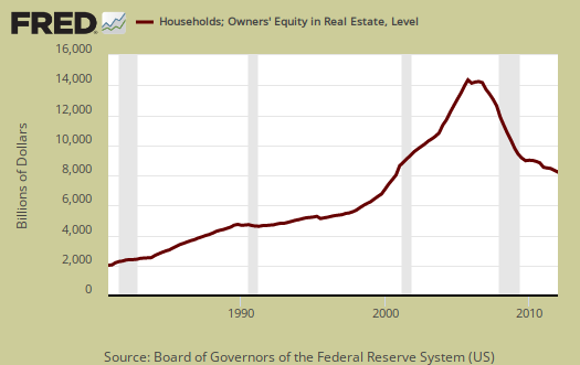
Home equity was $6.69 trillion, an increase of $457 billion from Q4 2011. As a percentage of total real estate holdings owner equity increased to 40.7%. Below is the graph for household net worth on a quarterly basis, end of period.

Household debt decreased -0.4%, yet all of that total was mortgage debt decrease, -2.9%. Consumer credit increased 5.8%. This figures are annualized. Household debt has been declining since Q2 2008.

Below are home mortgages. While reducing household debt at first glance might sound good, less mortgages doesn't mean people paid off their loans, it means people lost their homes in foreclosure or sold them, short. It can mean people nowadays potentially cannot afford a mortgage. It also can mean people are waiting to buy a home.

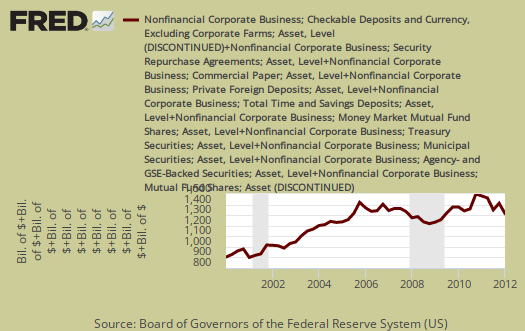
Corporate cash is now $1.74 trillion. Corporate cash has also been significantly revised down by half a trillion, which the Wall Street Journal examined in their number of the week. Yet seriously, can corporate cash really be revised down $500 billion in a quarter? We're not alone in asking that question.
The 2011 year-end number was revised downward from $2.233 trillion to $1.736 trillion. With this revision, cash has not soared to unprecedented levels. Instead, it has remained stuck near 11% of GDP since 2004.
Below is a graph of corporate cash.

Most of the flow of funds revisions were dramatic. The Fed has a details at this link, although the amazing drop in corporate cash is still unexplained.
The flow of funds is impossible to read and over 100 pages. So you might be interested to know exactly what is meant by businesses are sitting on a butt load of cash that the press reports but does not explain.
The report is for incorporated businesses which are not financial or farms. That excludes insurance companies too. Then, liquid assets are also referred to as cash. Why? Because this stuff is easily turned into currency or directly represents currency, such as time deposits. What does the Fed classify nonfarm, nonfinancial businesses' assets as liquid? The list is: municipal securities and loans, commercial paper, checkable deposits and currency, total time and savings deposits, money market mutual fund shares, total U.S. government securities, private foreign deposits, federal funds security repurchase agreements, and mutual fund shares.
In the flow of funds report, you can find total liquid assets on line 41, p. 67, L.102 Nonfarm Nonfinancial Corporate Business table.
Here is last quarter's flow of funds overview, only graphs revised.
Even though this report was released last week, we decided to overview it, mainly because the flow of funds is different from the survey of consumer finances. This report made headlines this week with the 40% decline in median household net worth, but the two reports are different. They use different methods and one is a surveys, in case one is getting confused. But then again, seems the Fed does do that, confuse.

Recent comments