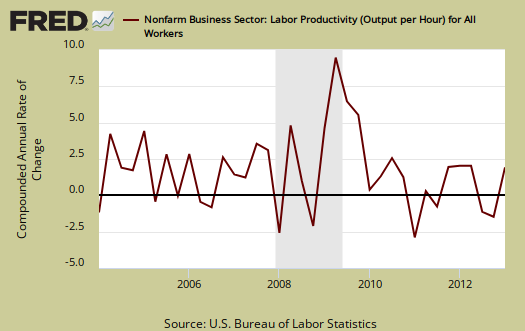
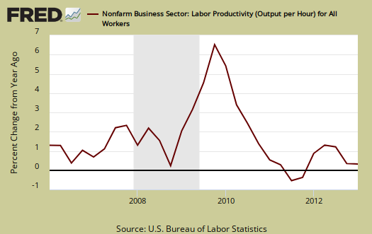
The Q1 2013 Productivity & Costs revision shows labor productivity increased an annualized 0.5%. Output increased 2.1% and hours worked increased 1.6%. Hourly compensation dropped -3.8% in Q1 2013. This is the largest quarterly decline for wages in history. Between the numbers lies even more bad news for workers. Labor is simply getting squeezed to death as workers created more while being paid less. This quarterly report also shows there is no worker shortage for compensation would surely rise if demand for workers exceeded supply. Below is an analysis of why the Q1 BLS productivity statistics are horrific news for American labor.
The basic equation for labor productivity is , where
is the total output of industry and
stands for labor. Output can be thought of as the cars which come off the assembly line to burgers & fries being served up at McDonald's. Here is the BLS labor productivity formula:
Labor productivity is calculated by dividing an index of real output by an index of the combined hours worked of all persons, including employees, proprietors, and unpaid family workers.
, or Labor, is measured in hours only. Business Output directly correlates to real GDP, minus the government, all of those nonprofits and our infamous, often illegal nannies and gardeners, and equivalent rent of owner occupied properties. The output, or
is about 75% of real GDP reported. Farms, if you can believe this, only subtract off about 1% from output totals. Labor productivity is reported as annualized figures and both indexes are normalized to the year 2005. The main productivity numbers above are all business, no farms, where labor costs are over 60% of output. These productivity statistics are referred to as nonfarm business.
From Q1 2012, a year ago, annual productivity increased 0.9%, output increased 2.4%, and hours worked rose by 1.5%. Changes from a year ago show a little less worker squeeze for compensation increased 2.0%. This means for Q1 2013 worker's paychecks were simply hammered. Additionally, output only growing 2.4% from a year ago shows just anemic economic growth.
BLS defines unit labor costs as the ratio of hourly compensation, to labor productivity, where is compensation
represents hours worked as above, or:
For more formula definitions see the BLS handbook. Below is the report description of the ratio relationship:
BLS defines unit labor costs as the ratio of hourly compensation to labor productivity; increases in hourly compensation tend to increase unit labor costs and increases in output per hour tend to reduce them. Real hourly compensation is equal to hourly compensation divided by the consumer price series.
Graphed below are unit labor costs, compounded annual rate, percent change. Unit labor costs plunged by -4.3% for Q1 2013. From a year ago, Q1 2012, labor costs are are up only 1.1%, implying workers are really still very cheap. Decreases in unit labor costs are due to less money for workers, less compensation for the same output. Increased productivity, or output per hour, for the same $$ paid to workers should show lower unit labor costs. These figures show labor arbitrage is alive and well in America for productivity is calculated by actual hours. Technology does play a hidden role in labor productivity increases with America's 24/7 salaried work life, where working 80 hours a week is paid for only 40 of those hours due to the exempt hourly status of salaried workers.

Graphed below are unit labor costs, indexed to 2005. We can see the decline starting in the Great Recession. This Q1 2013 cliff dive in unit labor costs is just more bad news for workers' pockets, yet when inflation is taking into account, the wage story becomes much, much worse.

Real hourly compensation is wages adjusted for inflation. Real hourly compensation is equal to hourly compensation divided by a special inflation series called the consumer price series* .
The consumer price series, , increased at a 1.5% annual rate from Q4 2012 to Q1 2013. By comparison's sake CPI increased 1.4% annualized for Q1 2013. Both of these figures are below the typical target annual inflation rate of 2.0%.
In terms of real dollars, adjusted for inflation, we have a revised annualized -5.2% decline in real hourly compensation for Q1 2013, non-farm businesses. In comparison to Q1 2012, real hourly compensation increased a measly 0.3%. Bear in mind these figures are all annualized, so in essence we have no change in real wages for an entire year. That is worker paycheck squeeze. Below are quarterly changes to hourly compensation, adjusted for consumer prices. You can see the rise and fall in real money with the flows of deflation and inflation.

The BLS also reports separately on manufacturing productivity, but uses a different calculation method than the one for business productivity. Don't think ya can subtract the below and get services productivity, the two ain't the same. Manufacturing is sales, removing duplicates, adjusting for prices and output () is correlated to shipments and the industrial production. indexes. Hours are hours like above. The report, p. 5, has the manufacturing productivity measurement details.
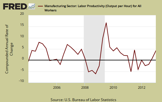
Manufacturing productivity increased 3.5%, for Q1 2013. Manufacturing output grew by 5.3%, while hours worked increased 1.8%. Since Q1 2013, manufacturing productivity increased 1.6% as output increased by 2.5% and hours worked showed a 0.9% increase. In essence, manufacturing had a blow out first quarter.
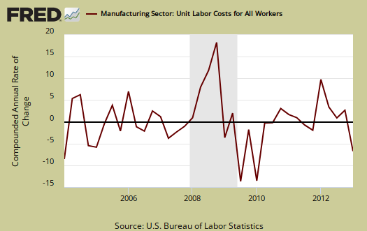
Yet once again, when it comes to labor, manufacturing workers are getting really screwed. Manufacturing unit labor costs declined -10.0% for Q1 2013. From a year ago, manufacturing unit labor costs are up 2.8%.
Compensation for manufacturing workers declined a whopping -6.9% for Q1 2013. This wipe out makes the gains in manufacturing hourly compensation from a year ago now 4.5%.

Q1 2013 real compensation (wages) in manufacturing declined -8.3%. From Q1 2012, real hourly compensation for manufacturing workers has increased 2.8%. Manufacturing wages are beyond not keeping up with inflation, the numbers look like plain labor arbitrage over time, as shown in the below graph of real hourly compensation for all manufacturing.

For Q1 2013, durable good manufacturing productivity grew by 3.5%, output increased 6.4% and hours worked increased by 2.8%. Yet none of this translated to workers. Durable goods labor unit costs dropped -11.2%, compensation dropped -8.1% and real compensation plunged by -9.4%. Graphed below is the durable goods manufacturing real hourly compensation index and marvel at the decline.

Unit labor costs in durable goods shows the decline of the American worker for they are returning to their lows. Unit labor costs show real output per hour. Durable goods workers are producing more and more and U.S. workers are getting less reward.

Nondurable manufacturing productivity increased 3.9%, output rose by 4.2%, yet hours worked only increased by 0.2%. Nondurable manufacturing unit labor costs decreased by -8.5%, hourly compensation also plunged by -4.9% and real hourly compensation decreased by -6.4%.
What you see these days in productivity is not what it appears. The press will claim increased productivity is a great thing, and maybe that's true for corporate profits, but it's clearly not translating into wages and jobs for workers. Labor share is a measure of how much of the economic pie goes to workers. If labor share increases, this implies labor is benefiting from increased economic growth. When the compensation to productivity gap widens, labor share falls and that means workers are not reaping the economic rewards of their sweat and toil.
Below is labor market share for nonfarm business which shows workers overall are getting less and less of the productivity pie.
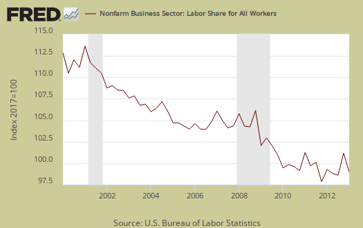
The productivity statistics for Q1 2013 look like the American worker simply fell off the economic middle class cliff. If Wall Street rejoices it is akin the picking the pockets of the dead. These statistics are simply a horrendous start for 2013.
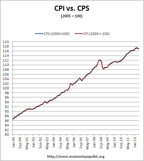
* The BLS productivity statisticians use CPI-U-RS, an unpublished inflation research metric, for the consumer price series. This consumer price series seems to flatten inflation, thus make the decline in U.S. wages less, although when normalized to a base year of 2005 the two series are the same for all practical purposes for over a decade, as shown in the below graph ending in Q2 2012. The implicit price deflator, applied to nonfarm business output (productivity), is from the BEA. CPS and the price deflator are all to remove inflation effects from the productivity statistics.

Labor productivity is tricky
This report came out on the 5th, so one maybe wondering why so late. Well, it takes time to write these things and productivity in particular, I like to show the ratios in words and in math form,. This is because as a concept, plus the way the statistics are presented, productivity stats are hard to follow, more often than not misinterpreted.
For example, annualized percentage change represents what the entire year would look like if that quarter keeps happening for the next three. So, it's larger swings than just quarterly percentage change.
Still, this report is awful, make no mistake and why I wanted to overview it in detail.
Phony "Big Squeeze" on Workforce Numbers
The Big Squeeze this time around, is on labor. The MNCs in the US, Australia, China and the rest of the World Economy are growing (except Europe which loves self inflicted pain). America too would accept self inflicted pain if we listen to the Siren Song of economic contraction through Budget Contraction.
The pain of the Big Squeeze derives from a perceived belief in a huge economic boom happening late in 2013. That economic boom is unsure.
Nonetheless, the business lobby is pressing the Senate to add 33 Million citizens over the next 10 years. 11 million through what is denied to be Amnesty and 20 Million Visa Workers. If continued for 100 years, the US population. All these numbers are within the bowels of S 744.
The 20 Million Visa workers added through S 744, over 10 years will augment the natural growth (births minus deaths) of 20 million more native born souls, excepting changes in contraception,abortion and immigration law. 20 Million net births has held constant for 23 years, back to 1990.
U.S. population is set to grow at 40 million in the next decade under S 744. Over 100 years the same growth is exponential, but at least 400 million should be added to U.S. population, arithmetically. This yields a population of at least 700 million within a 100 years. An expanded population of 40 million and it's workforce consequences is far more immediately relevant. For example, what should happen to the appaling low rate of Workforce Participation? That rate must drop dramatically, approaching the 50% rate of underveloped nations. This is not theory, but necessity arising from demographics of S 744.
Business lobbies will claim a squeeze on labor availabilty. How can demographics justify a squeeze? Or how could stuctural high unemployement justify any immigration at any level?
Burton Leed