
JOLTS stands for Job Openings and Labor Turnover Survey and the August report was released today.
There are now 4.6 counted workers per job opening. Bottom line, little has changed from last month.
There were 3.2 million job openings on the last business day of August 2010, the U.S. Bureau of Labor Statistics reported today. The job openings rate was unchanged over the month at 2.4 percent. The hires rate (3.2 percent) and the separations rate (3.2 percent) were little changed.
The JOLTS takes a random sampling of 16,000 businesses and derives their numbers from that. The survey also uses the CES, or current employment statistics, not the household survey as their base benchmark. These means all of those people not counted are not in the baseline of this survey.
The BLS was kind enough to make a credible Beveridge Curve graph, reprinted below. The Beveridge curve shows the official unemployment rate vs. the job openings rate. If you see a bunch of data points to the far right, that's bad, it means there is long term unemployment and not enough jobs.
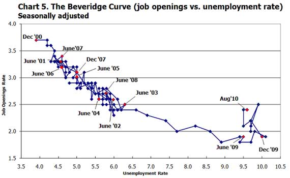
Unfortunately this is blamed on labor market inefficiences, trying to claim a skills mismatch or a rejection of long term unemployed as workers (which is happening). Let's also point to globalization, offshore outsourcing, where companies are simply not hiring U.S. workers.
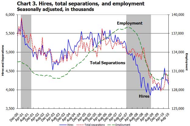
Below is another BLS provided graph of total hires, total separations and employment. Notice how hires and fires are matching each other, with fires (separations) slightly higher 4.2 million) than hires (4.1 million), which explains the lost jobs each month.
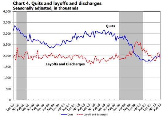
The I Quit damn it! vs. You're Fired! graph, again from the BLS is shown below. Basically almost no one quits their job unless they believe they can get a new one. Layoffs and Discharges means firings, or as tacky HR likes to say, involuntary separations.
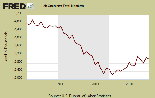
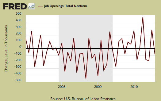
Once again we have the press writing fuzzy feel good stories, trying to claim job openings have increased. Below are graphs on job openings from the JOLTS survey. The first is the total.
The next is the absolute level change, monthly. Anyone see a huge number of job openings? I didn't think so.
The BLS has all sorts of occupation and sector data and also put together a separate set of graphs that help make sense of it all. Here is their website.
Recent comments