You might be wondering how the unemployment rate could stay the same, 9.1% while zero actual payrolls jobs were added. When the unemployment report is released, it's actually a 2fer. There are two separate surveys or reports: the current establishment survey, which reports on nonfarm payrolls only, and the the household survey, which uses the Census population estimates as a base. The establishment survey has an error margin of 100,000 per month, while the household survey has an error margin of 400,000 per month. Additionally the establishment survey is jobs, as reported by employers. It is W-2 types of jobs and doesn't count agriculture workers to boot, whereas the household survey estimates the self-employed, farm workers, the glorified servants of the uber-rich and my favorite, unpaid family workers.
Additionally the survey timing is different. The establishment survey picks up the pay period which includes the 12th of that month. So, whether one is paid hourly, daily, weekly, bi-weekly, monthly, they just look at the pay period which includes the 12th. No pay on the 12th and you're paid daily, then that job doesn't count, including unpaid sick days. Working one hour a month and it magically falls on the 12th? By this survey, that's actually a job.
The Household survey, also called the current population survey also takes results for the week which includes the 12th day of each month. People are counted as employed in this survey, even when they are absent from their jobs for that entire week, paid or not paid.
For more details on the surveys, see this FAQ.
Ok, how did we get zero jobs when the Household survey said 331,000 more people were employed this month than last? It's because of the apples and oranges differences between the two surveys. There is error, the household survey counts self-employed, agricultural workers, those on unpaid leave, unpaid time off, those on strike and those working in the home unpaid. Additional the household survey is scaled by population estimates, which for this report, are based on the 2000 Census and also have a yearly adjustment.
Fortunately the BLS gives us yet another report, recent trends, to compare the two surveys.
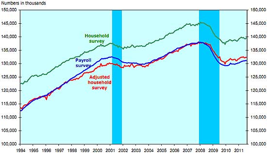
First, they went ahead and removed the self-employed agriculture workers, unpaid leave and such to make the employed count more similar to nonfarm payrolls. This adjusted number says 134,000 more people were employed in August than July.
Next, they show the two surveys have always varied widely in terms of aggregate totals. Part of this is the household survey uses population estimates when it extrapolates out it's results from the survey to the entire country. Below is their graph of not only the two surveys since the methods were changed (1994), but also their adjusted version of the household survey, to make it cover closer what the establishment survey does.

With that, let's look over some of the Household survey statistics for August 2011.

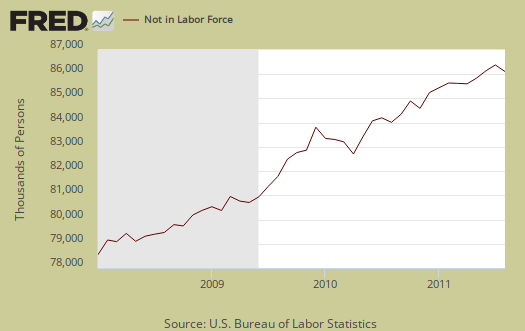
Those entering not in the labor force decreased by -165,000. The above graph shows the dramatic increase since the start of this recession. This is where people who fall off of the employment statistics count go. The labor force participation rate ticked up 0.1% to 64%.
The civilian labor force increased 366,000 while the civilian non-institutional population increased by +200,000. What this means more people came out of the shadows to be counted as either employed or unemployed.
How can the unemployment rate stay the same when there were no damn jobs? The official unemployed increased by 36,000, alternatively the employed increased 331,000. The actual labor force jumped by 366,000, simply because on top of population growth, so many were added to the count. The employment to population ratio increased 0.1% to 58.2%. The employment rate is a ratio, the unemployed to the civilian labor force and why the rate remained the same. The unemployed increased, but so did the civilian labor force.
So, how could the household survey employed number, 331,000, jump so high in a month with no damn jobs? Agricultural workers increased 110,000 and self-employed increased 25,000. We also have the striking Verizon workers who reduced payrolls by 45,000, but are counted in the household survey. The BLS also estimates the number of unpaid family workers, but it is not seasonally adjusted. August's tally was 66,000. That's 241,000 jobs in areas the establishment survey doesn't count. The Verizon striking workers shouldn't have been counted as unemployed, but it's unclear what happened in this case. Regardless, as we can see, delving into the details, the discrepancies between the two surveys can be explained.
Odds on, these jobs from the household survey are not great jobs. The new trend is to claim people working 1099-misc are self-employed, all to undercut hourly wages, labor law and benefits. Employers force workers to be contractors, instead of hiring them as employees.
Below is an annualized, by averaging method, graph in the yearly civilian non-institutional population change. It's from this superset of people that potential workers come from. This is why one must create jobs greater than the constant rate of jobs lost. There are more people to employ. unemployment is a percentage, a ratio.

The BLS unemployment report counts foreign temporary guest workers as well as illegal immigrants in their U.S. labor force statistics and doesn't report statistics by immigration status, unfortunately.
The civilian non-institutional population are those 16 years or older not locked up somewhere or not in the military or so sick and disabled they are in a nursing home and so on. The rate continually increases. Compare that fact to the graph of the civilian labor force, or those actually counted in the employment statistics. While there appears to be high variance on a month to month basis, overall the size is decreasing. Think about it, the population is increasing and the labor force is decreasing. Not a good sign.

For the actual labor participation rate and employment ratios and graphs, see a big fat zero unemployment report article.
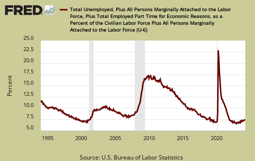
U-6, or the broader unemployment measurement, increased 0.1% to 16.2%. U-6 includes the official unemployed, people stuck in part-time jobs because either their employers cut their hours back or that's all they could get and what is called the marginally attached, or those not in the labor force officially tally but who looked for a job in the past year.
A graph of the alternative unemployment measurement, U-6, is posted below. Here you can see the incredible increase in comparison to the beginning of 2007.

You might also be interested in reading What's the real unemployment rate?, which calculates a series of measures and shows you the assumptions and calculations.

at least two more articles on the unemployment report
There will be at least two more articles on the unemployment report, One on length, types of payroll jobs, overall, part time, which is through the roof and another with some demographics, such as the black unemployment situation, the young, the old and whatever else useful can be extracted.
Stay tuned!
Bravo Robert!
This is exactly the kind of info we need.
Frank T.
Question for readers on these economic report overviews
I'm doing something new this time and breaking up the unemployment report.
Is it better to break it up or do people want it all in one large post?
The reason I'm breaking it up is frankly it is so easy to make a huge mistake. An assumption error, reading something wrong, the wrong assumption on say civilian non-institutional population, or how part-time affects employment numbers...
the list goes on and on. So, I saw some things in this report I needed to reality check, which I try to do to make sure all of my article ducks are in a row.
Takes much longer so I decided to break up the overviews into subtopics, else nothing would be written and as it was there was a huge delay because I had to go study up and run some more numbers.
The good news is as far as I know this site gets it right much more and better than most in the MSM.
I guess the proof in the pudding would be a call out by some statistician at the BLS themselves or a major economics, con matematicas por favor, but anywho, wondering if it matters.
I don't want to just regurgitate the actual report or simply throw up some graphs to accompany it for that's the entire problem with government reports...
the idea here is to amplify some of the data, plus graph it all up so there are visuals, and make some sense out of it for real people.
BTW: When I make a mistake, it's myself who has to catch it, so if someone sees an error please let me know. I despise economic fiction, intentional or otherwise. ;)
Organize by Topic
For us non-economists, I think sections with headings (one for each graph) would be easier to follow. Excellent graphs, BTW. They could be in the same document, but point-by-point presentation with some interpretive comments. Many of us have backgrounds in related fields, but as Chairman Mao said, "When eating sticky candy, take small bites." For example, unemployment rates by month are useful, but also followed by section on part-time or discouraged workers might be useful. Also such indicators as length of work week, average wage, etc. if they become meaningful to interpret presentation. Which to present is your call, but we are nothing if not critical -- so lead on, professor.
Frank T.
inside post or on site?
Do you mean like this:
this is the part time data section
blah blah we are screwed blah blah
This is the payrolls detail section
Of course there are no jobs and guess what corporations won't allow how many jobs they created offshore instead be revealed!
======================
and put it all into one post?
Or do you mean more menus and site organization?
The St. Louis FRED system is absolutely awesome and it enables me to speed up analysis, heavily, configure graphs very quickly. Myself, I can see patterns in numbers but regardless, nothing spells it out better than a visual, a graph.
If I can't make it in FRED then I make the graphs in Excel.
Thanks. I have to take into account this site is a news source too and follow those requirements. They don't like a lot of modifications to an article after publication, so I'll have to think about this.
The name of the game is to translate the cryptic reports into bloggerspeak and English so people can see how screwed we really are, by the numbers.
Excellent
I think your style of presenting graphs with commentary is great. A single article, but with main summary point after each graph will work. Use your judgment. Agree the FRED graphs are great. My suggestion was to have headline after each point, which you kind of already do. Bravo zulu!
Frank T.
If It's Easier For You, Split Into Several Posts
If you are finding it hard to do everything up in one post, it's probably a sign it's time to split it up. Anything you can do to make things easier for you, with all your expertise, will probably have the additional benefit of making things easier for readers like me who never studied economics or higher mathematics.
I will tell you something else that I have just realized that's really scary: We are now in largely uncharted economic territory.
Of course we've had our down periods before. But now we have the many new twists to old problems created by globalization and interference with our labor market and economy. We have never had to recover from a severe recesssion in which foreign currency manipulation, exotic financial instruments, outsourcing, mass migration, etc., etc., were major factors. We also have the problem of denial and obsfucation about the effects of these things. It's a doubly heavy burden (at least) that prior generations did not have to deal with.
It seems to me that our data collection and interpretation systems and methods are not set up to handle this. Adjustments must be made that will take some time -- for one thing, I do not think we even know what should be changed and how yet.
So it's my prediction that if you can stand to continue doing what you are doing, it's going to get harder. The data you can find will seem inadequate to explain what's going on more often. The data that's not collected will cause more noticeable holes in any hypothesis. What you don't know and can't find out will start to take on a greater importance and worry you more.
Please pace yourself. Don't try to do too much.
The road to economic recovery -- are we even on it yet? -- is going to be a very long and bumpy one, I'm afraid.