
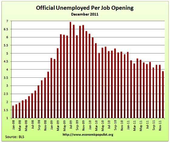
JOLTS stands for Job Openings and Labor Turnover Survey. The December 2011 statistics show there were 3.88 official unemployed people hunting for a job to every position available*. There were 3,376,000 job openings for December 2011, an increase of 8.27%, from the previous month of 3,118,000. This is a marked improvement from last month. While job openings have increased 60% from their June 2009 trough, jobs are still way below the 1.19 person per job opening at the start of the recession. Below is the graph of number of official unemployed, 13.097 million, per job opening for December 2011.
Realize the December JOLTS survey is using the Census and BLS data from before the January 2012 revisions. The 2010 Census and the payrolls benchmark revisions will be incorporated into the JOLTS report for January 2012.
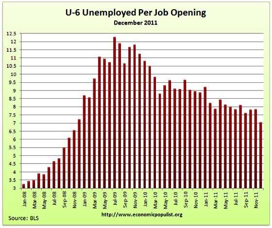
If one takes the official broader definition of unemployment, or U-6, the ratio becomes 7.03** unemployed people per each job opening for December. The December U-6 unemployment rate was 15.2%. Below is the graph of number of unemployed, using the broader U-6 unemployment definition, per job opening.
If you do not like the use of U-6 to look at the real number of people looking for a job to actual opportunities, consider this number. In December 2011, of those not in the labor force, 6,385,000 were actually wanting a job. U-6 only includes 2,540,000 of these people.
The rates below mean the number of openings, hires, fires percentage of the total employment. Openings are added to the total employment for it's ratio. Openings rate increased from 2.3% to 2.5% for the month but hiring & separations had no change. Firing rates decreased a 10th of a percentage point as a ratio, which is also a good sign. It's been like Schindler's List out here in work land, so we have a long way to go.
- openings rate - 2.5%
- hires rate - 3.1%
- separations rate - 3.0%
- fires & layoffs rate - 1.2%
- quits rate - 1.5%
Job openings jumped 258,000 from last month to 3,376,000. Professional/Business services alone increased 149,000 in job openings. Manufacturing job openings increased 22,000 and retail trade, otherwise known as crappy jobs, increased 29,000. Below are raw job openings, still below the 4.4 million pre-recession levels.
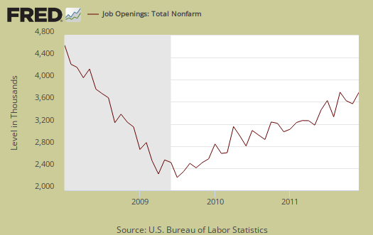
Believe this or not, one month past the so called end of the Great Recession, July 2009, job openings have only increased by 1,264,000. July 2009 was the low point of job openings, 2,112,000. In March 2007, a few months before the start of the recession (December, 2007), the number of job openings was 4,755,000.
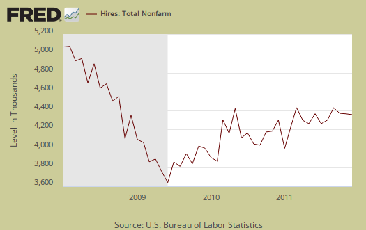
December's hires were 4,046,000, a statistical flat line, or 0% change from November's 4,132,000 hires.
Below are total job separations, 3,909,000, a -1.98% decrease from last month, 3,986,000. Government had an increase of 15,000 separations from November. The term separation means you're out of a job through a firing, layoff, quitting or retirement. The report has a breakdown of separations, hires and openings across occupational categories. Layoffs and firings were 1,644,000 of the total 3,909,000 and to pre-recession levels.
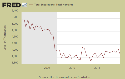
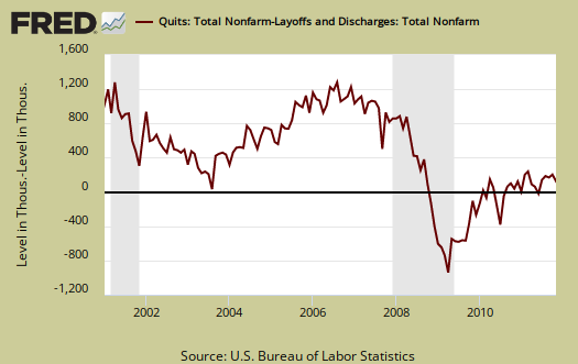
For December, of total separations, the quits were 49% whereas layoffs and fires were 42%. Below are quits minus discharges and layoffs. When quits comes close to firings that means people have little choice in employment. You want to see choice, or quits, rise and be much higher than firings. The below graph shows people still do not have that many options when it comes to a job, for the ability to quit your job, shown in the number of quits, 1,926,000 for December, is still way below pre-recession levels of 2.8 million. The ratio of quits to firings, is nowhere near the 2009 mass firings and layoffs, not to say that blood letting isn't still happening, it is.
The JOLTS takes a random sampling of 16,000 businesses and derives their numbers from that. The survey also uses the CES, or current employment statistics, not the household survey as their base benchmark, although ratios are coming from the household survey, which gives the tally of unemployed.
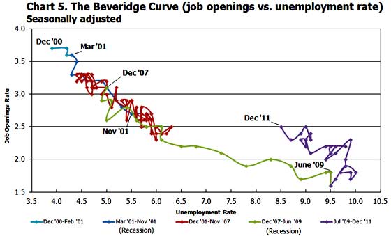
The BLS was kind enough to make a credible Beveridge Curve graph, reprinted below. The Beveridge curve shows the official unemployment rate vs. the job openings rate, over time. If you see a bunch of data points to the far right, that's bad, it means there is long term unemployment and not enough jobs. Look at how we're stuck to the right. December 2011 moved left and up. That means job openings increased, the unemployment rate decreased. The December 2011 unemployment rate was 8.5%. A right and up move in the Beveridge curve can indicate a skills mismatch, so this graph also refutes the corporate lobbyists claim there is a skills shortage per their cheap labor arbitrage agenda. The green, representing the 2009 time period, shows how fast we went to the right and the purple, which is 2010, 2011, means we are stuck in job market malaise. All of that purple line is the last two years and shows the U.S. worker is stuck and stuffed, in no man's land for jobs. So, this up and left move on the Beveridge curve is welcome news. Don't forget to look at how awesome 2000 was for landing a job in the graph below.
JOLTS includes part-time jobs and does not make a distinction between part-time, full-time openings. A job opening reported to the survey could literally be take out the trash twice a week and be counted. This is a shame, it would be nice to know a little more about the quality of these new opportunities.
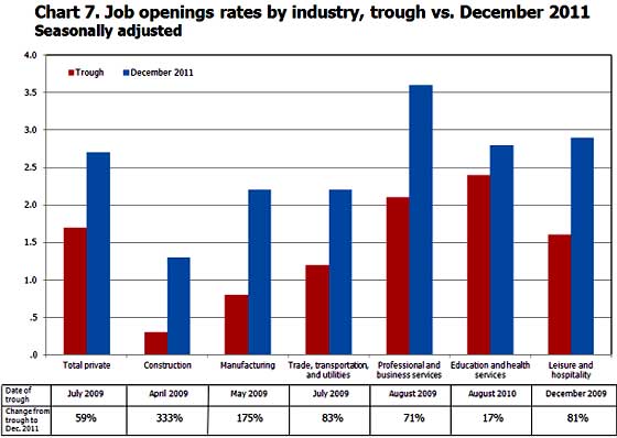
For the JOLTS report, the BLS creates some fairly useful graphs, some of which were reprinted here, and they have oodles of additional information in their databases, broken down by occupational area. The Saint Louis Federal Reserve also had loads of graphing tools for JOLTS. Below is a reprint of the BLS graph showing the percent change in job openings from the July 2009, there were no jobs trough. Just unbelievable how construction jobs dried up during that time. The 333% increase in construction job openings first looks great, but more it should show you just how bad it got for construction workers.
Professional and technical services is notorious to import workers on foreign guest worker Visas, displacing Americans. Unfortunately the government refuses to separate out U.S. workers from foreign guest workers in their data. This can distort certain occupational categories and hide the fact Americans are being labor arbitrated.
*The BLS rounds up to 1 decimal place.
** is defined as the official unemployed plus people who are in part-time jobs for economic reasons plus the marginally attached. The marginally attached,
, are officially not part of the civilian labor force,
, and also not seasonally adjusted. The above graph was created by the seasonally adjusted levels of the unemployed, part-time for economic reasons and the marginally attached. The raw U-6 totals can also be calculated by this formula, which gives a slightly higher ratio.
where
Last month's JOLTS overview is here, unrevised. There appears to be significant revisions to the hires, job openings for November, so it's best to look at the November data from this report, it's the most complete.
better late than never
I know people look for our U-6 job openings chart. I had to make sure I was using the right data series, historical, for number crunching this time and some other things. Thanks for your patience.
Bottom line, we have more than one indicator our labor market is "rising from the dead". I'd say it's still a Zombie, but some of the flesh one corpse is starting to come alive, not completely rotten at this point. (yea!)
headlines and lies and buzz
I just checked the MSM and first, this is NOT a 3 year high. We had this number of job openings in September 2011. We then had a dip but this is why we love graphs, you can do a reality check and it's a huge improvement, but not this headline buzz "3 year high".
Next up in terms of lies, people do not have to quit their jobs to improve the labor market. Quits are a by-product of a health job market, but claiming people need to quit to improve things is false, we need lots of better jobs so people feel "safe" to quit their jobs. Another cart before horse headline buzz.
Then, there is no skills mismatch going on, as we see from the Beveridge curve. True a lot of jobs in professional, business but the unemployment rates in these categories are double what they should be and were before this recession. Have a lot of people left to employ before there's any problem.
Folks, help us out, consider sharing a link to this post in comments on these MSM sites. How hard is it to get these data reports right by the press? I guess very tough!