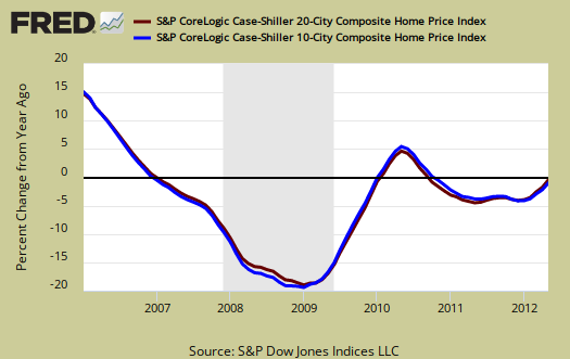
The May 2012 S&P Case Shiller home price index shows a -0.7% price drop from a year ago for over 20 metropolitan housing markets and a -1.0% decline for the top 10 housing markets from May 2011. This is the smallest annual price decline in 18 months. Not seasonally adjusted home prices are now comparable to April 2003 levels for the composite-20 and July 2003 for the composite-10, but up 2.2% for the month. Both composites are now down -33% from their 2006 home price bubble peaks. March 2012 home prices were record lows. Below is the yearly percent change in the composite-10 and composite-20 Case-Shiller Indices, not seasonally adjusted.
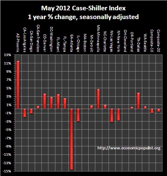
Below are all of the composite-20 index cities yearly price percentage change, using the seasonally adjusted data. We see Phoenix rising, up 11.5% from a year ago and the burning of Atlanta, down -14.6% from a year ago
S&P reports the not seasonally adjusted monthly data for their headlines. Housing is highly cyclical. Spring and early Summer are when most sales occur. See the bottom of this article for their reasoning.
This month the not seasonally adjusted April to May change matched the not seasonally adjusted ones. For the composite-20 this was -0.7%. The composite-10 yearly change was -1.0%.
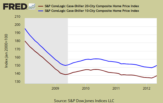
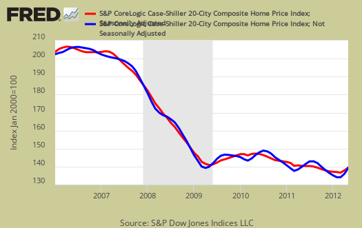
The above graph shows the composite-10 and composite-20 city home prices indexes, seasonally adjusted. Prices are normalized to the year 2000. The index value of 150 means single family housing prices have appreciated, or increased 50% since 2000 in that particular region. These indices are not adjusted for inflation.
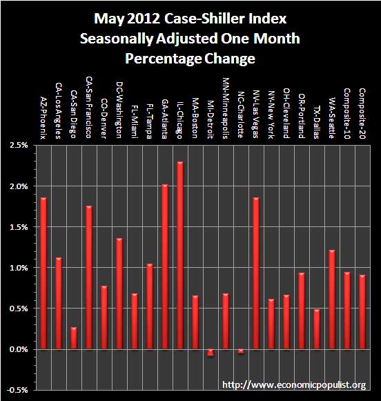
News headlines on the S&P Case-Shiller Housing Index often differ. Some in the press use the seasonally adjusted data, and others do not. Some report the monthly change, others the annual change. S&P themselves use the not seasonally adjusted housing price data. To make matters worse, some in the press do not specify which statistic they are quoting from S&P. Below are the seasonally adjusted monthly home price percentage changes for each City reported by S&P.
Below are the seasonally adjusted indices for this month. Folks spin these indexes with percentages while the index itself tells you what has happened to home prices, per city, from the year 2000.
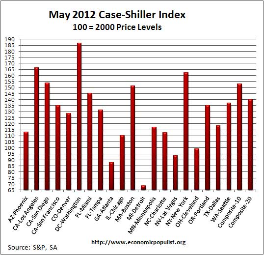
Either way you look at this month's data, most metropolitan area housing prices came off from their bottoms. From the S&P press release, using the not seasonally adjusted home price indices:
Taking a closer look at the cities, Phoenix again posted the best annual return. Average home prices in that region were up 11.5% versus May 2011. It was one of the hardest hit cities in the collapse, and prices are still more than 50% below their June 2006 peak, but the past five months have been positive for that market.
Miami and Tampa are two other Sunbelt cities that were hard-hit in the downturn, but are now showing positive annual rates of change. Boston, Charlotte and Detroit, on the other hand, saw their annual rates of return deteriorate compared to April, even though prices rose over the month of May. Las Vegas posted both a positive monthly change in May and saw an improvement in its annual return; that said, the market is still more than 60% below it August 2006 peak
To Season or Not to Season, That is the Question:
The S&P/Case-Shiller Home Price Indices are calculated monthly using a three-month moving average and published with a two month lag. Their seasonal adjustment calculation is the standard used for all seasonal adjustments, the X-12 ARIMA, maintained by the Census.
So, why would S&P report the not seasonally adjusted data? According to their paper on seasonal adjustments, they claim the not seasonally adjusted indices are more accurate. It appears the housing bubble burst screwed up the cyclical seasonal pattern. What a surprise, although those steep cliff dives are now going back to 2009, one would think the seasonally adjusted data would now start to converge back to it's cyclical, seasonal pattern.
The turmoil in the housing market in the last few years has generated unusual movements that are easily mistaken for shifts in the normal seasonal patterns, resulting in larger seasonal adjustments and misleading results.
To see S&P's argument in action, look at the below graph. The maroon line is the seasonally adjusted national index, reported quarterly. The blue line is the not seasonally adjusted national index. As we can see before the housing bubble burst, we see a typical cyclical pattern difference between the seasonally adjusted and not seasonally adjusted data points. Yet after the bubble burst we see large swings, which would throw off a seasonal adjustment adaptive algorithm. This is going to become a major question among statisticians, how does one adjust for seasonality in the face of tsunami like economic events?
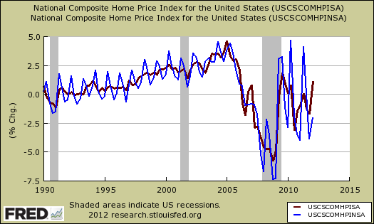
Not seasonally adjusted data can create more headline buzz on a month by month basis due to the seasonality of the housing market. S&P does make it clear that data should be compared to a year ago, to remove seasonal patterns, yet claims monthly percentage changes should use not seasonally adjusted indices and data. This seems more invalid than dealing with the statistical anomalies the massive housing bubble burst caused. Below is the seasonally adjusted and not seasonally adjusted Composite-20 Case-Shiller monthly index.
For more Information:
S&P does a great job of making the Case-Shiller data and details available for further information and analysis on their website.
Here is our overview from last month.

irrational exuberance on home prices in the press
Those bubble people are so desperate for a return to the housing bubble it's beyond reason. Folks, this is a better report, but it's not that much better. More importantly, going off of one month of housing data, in spite of S&P's superior statistics, is a huge mistake. Don't do it, don't buy in. Home prices being flat with a one month bump up of 2.2% is simply not going to pull the economy out of it's doldrums. Sorry, no way in hell.
Sanity from Calculated Risk
Calculated Risk compares home prices to rents and also performs inflation adjustments. Sorry to burst your bubble, but you want to read these additional statistics. Most noteworthy is how distressed home sales have been flat, with huge REO, estimated at 85-90% of all REOs (bank owned, foreclosed properties) are being held off of the market.
Shadow inventory is HUGE unaccounted for factor
How many houses are purposely being held by banks off the market to artificially inflate the house prices they are actually trying to move? The fact is with so many houses underwater, in foreclosure, and neighbors of those houses not selling now because they are waiting for better times much later on (i.e., they would be selling - but just not worth it), any "rise" will be complete propaganda/lies for many years to come. Just like any drop in unemployment rates is caused by statistical games and increasingly ignoring greater proportions of the population who are now unaccounted for. I also notice the correlation know that somehow the press is saying fewer initial unemployment claims = job growth? Not sure how fewer people being fired every week (but still 350,000-400,000) is equated to people getting hired (especially with dismal job growth numbers that are actually lower than the initial weekly claims), but that's the new lie - fewer people being fired = more people being hired (pure nonsense).
shadow inventory, NAR
We're written about the massive shadow inventory multiple times. Here is our latest NAR take down. Click on the meta tag "residential real estate" to see all of the housing overviews, where distressed sales, REOs stats are kind of littered in between these reports.
I agree, I think they are trying to re-inflate housing prices and this site is one of the few which really digs around into housing statistical releases looking at spin and pointing it out. NAR is beyond belief full of it to the point they scare me that they report inputs into the NIPA. These are the accounts which determine GDP.
The fact is America is tapped out. I don't know who can afford even a $200k mortgage with 5% down, never mind a $300k one with the below poverty wages, labor arbitrage, unemployment going on.
On initial claims, it's just a rule of thumb, below 375k fires (or UI claims), implies job growth, it's just a correlation. The nation is now massive worker churn, see the latest statistics over in the left hand column, bad news for U.S. workers.
So, less fires, means those monthly hires that occur increase job growth. Kind of like a pump is filling a glass with a hole in the bottom, less water out of the hole in the bottom with a constant water flow from the pump means the glass will get fuller.
That said, the BLS counts illegal workers and all foreign guest workers in their employment statistics. There literally are millions of these foreign guest workers and it does skew the data, especially in some occupational categories, such as STEM. Illegals are something like 10-20 million estimated, most working age and they clearly really skew the unemployment statistics for American workers as well.
Check back on Friday for we go over the BLS monthly employment report like flies on s**t. It's graph-o-rama with many hand calculations from the raw statistics. We also calculate, and from the government statistics, so you can follow along, all published data, our own alternative unemployment rate and levels of people needing a good job. It's over 27 million, over 18% unemployment rates, that's incredible! These calculations also include foreign guest workers, illegals, simply because the BLS (Congress) refuses to separate out the work force by immigration status.
While the BLS counts foreign guest workers, last I heard and never said never, illegals and foreign guest workers cannot collect UI. So, they should not be in the initial unemployment claims statistics (we hope).
The jobs destroyed aren't coming back though = no growth
I understand that a slower rate of negative change, in certain circumstances, signals a positive change is coming in certain subjects/fields. But in employment stats, it doesn't make sense. For instance, a NJ branch of a pharmaceutical company laying off 1,000+ Americans to move operations to Asia or Europe doesn't mean job growth is coming for those Americans or pharmaceuticals in the US. Banks and tech companies moving support operations to Asia create thousands of newly unemployed. While the rate of firings decrease as inevitably fewer people left to fire in the US, it doesn't equate to growth. It simply means those people have been replaced by someone and those jobs are gone. In essence, a zero sum game that Americans will lose.
underemployment relationship
I'll have to show the correlations of UI to nonfarm payrolls and give new estimtes next time I overview UI. I write up UI about once a month, usually when the press has gone insane over a 1 week window statistic that they should not give that much weight to.
For now, the ratio has dropped in terms of UI vs. "job growth" indicator", plus we have massive underemployment. Our policy makers believe it's just fine and dandy that highly educated PhDs should work as administrative assistants and Home Depot sales associates. As overall population increases so do these low paying service jobs, retail trade, to adjust for basically population growth.
So, bottom line, next time I do UI, which is probably in 2 or three weeks, I will make a point to number crunch the correlation to payroll data, as well as CPS employ levels.
You won't hear any argument from me on between politicians and corporations, they have literally ruined this country by global labor arbitrage.
Unemployment / Housing
The mortgage purchase application statistic / index released by the Mortgage Bankers Association weekly has been in steady decline since February, And it has been declining nearly every week during the May-now peak home buying season.
This is the one stat that should be paid attention to as it reflects the actual number of mortgage applications received
As for unemployment stats, Mike Williams from Shadowstats.com states the acutal unemployment figure as of July 5th to be around 25% Factor in Underemployment and this is truly a sad picture
We've reached a point where no Govt statistics regarding virtually anything should be believed