
Consumer spending increased 0.5% from last month, yet when adjusted for inflation was only a 0.1% increase for August. Consumer spending is a name coined by the press and means personal consumption expenditures or PCE. Real personal consumption expenditures are hugely important to economic growth as consumer spending is about 71% of GDP.

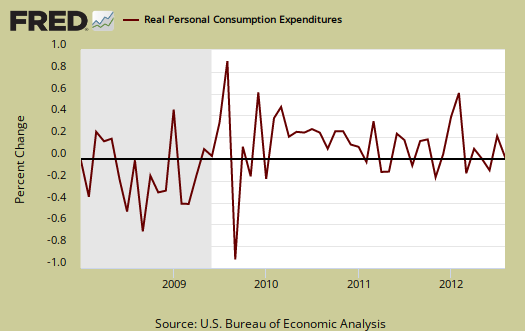
Personal income increased 0.1% yet when adjusted for inflation, disposable income decreased, by -0.3%. People had less real money to spend in August. Graphed below are the monthly changes for real personal income (bright red), real disposable income (maroon) and real consumer spending (blue).

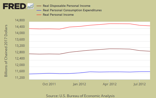
Below are the real dollar amounts for real personal income (bright red), real disposable income (maroon) and real consumer spending (blue).
Consumer spending encompasses things like housing, health care, food and gas in addition to cars and smartphones. In other words, most of PCE is about paying for basic living necessities. Graphed below is the overall real PCE monthly percentage change.
What people spent money on, adjusted for prices, or in real dollars, by monthly percentage change was:
- durable goods: +0.5%
- non-durable goods: -0.3%
- services: -0.1%
Health care, for example, is a service. Gasoline is a nondurable good. Cars are a durable good. Additionally when people are cutting back, durable goods are usually the first things to go, especially large ticket items. Autos was cited as the reason real durable goods spending increased.
Price indexes are used as divisors to adjust for inflation and price changes. The indexes are used to compute spending and income for an apples to apples, real dollar comparison to previous months and years. Economic statisticians use real dollars so one does not erroneously assume economic growth when it's really inflation.
The PCE price index is used to remove inflation from consumer spending and income, reported above. The price index increased 0.4%, for August and is up 1.5% from a year ago. Energy alone, which includes gasoline, increased 5.8% in a month. Minus energy and food, the price index increased 0.1% and is up 1.6% from this time last year. While the PCE price index represents inflation, it is different from CPI. Food is claimed to have only increased 0.1% for August. Who finds food increasing only 0.1% when the drought causing prices to soar unbelievable?
While personal income increased +0.1%, these numbers are the total for everybody in the United States who is reported and not part of the underground economy. Below is personal income, not adjusted for inflation, or price changes.

Real personal income, or personal income adjusted for inflation, via the PCE price index, and also government payments, such as social security, are removed, decreased -0.3%. Below is the graph of real personal income.

Why the BEA report doesn't give real personal income monthly changes including transfer receipts, instead of excluding them, I do not know. Below is the monthly percentage change in real personal income, or adjusted for inflation and excluding payments from the government.

Disposable income is what is left over after taxes. DPI (disposable income), increased 0.1% from last month. DPI adjusted for inflation (see the price indexes above), decreased -0.3% , from the previous month. These numbers are aggregates, which includes income of the uber-rich, or the 1% of the population, as they are now called.

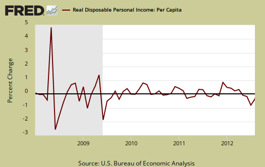
Below is real disposable income per capita. Per capita means evenly distributed per person and population increases every month. August mid-month the U.S. population was 314,593,000, in increase of 215,000 from last month. In other words, while on aggregate personal income has increased, so has population to earn that income. When taking increased population into account, we basically have no growth in real disposable personal income and this is over years.
The monthly percentage change for wages and salaries was 0.1% as was total compensation, which includes wages, salaries. Landlords just keep making out like bandits, rental income increased 1.2% in a month and proprietor's total income, with inventory valuation and capital consumption adjustments, increased 0.6%. Personal receipts, income on assets, decreased by -0.2%. This is income from non-incorporated businesses, such as the self-employed. Dividend income increased 1.1% for the month, interest income, -1.3%. Investors win again, savers lose.
Private wage and salary disbursements increased $4.7 billion in August, compared with an increase of $9.3 billion in July. Goods-producing industries' payrolls decreased $6.4 billion, in contrast to an increase of $3.2 billion; manufacturing payrolls decreased $5.2 billion, in contrast to an increase of $3.4 billion. Services-producing industries' payrolls increased $11.2 billion, compared with an increase of $6.0 billion. Government wage and salary disbursements increased $0.7 billion, in contrast to a decrease of $0.7 billion.
Graphed below are wages and salaries for the past decade. Notice the dip and the more flat line than earlier in the decade. Bear in mind these are aggregate, or all wages and salaries, and not adjusted for inflation.

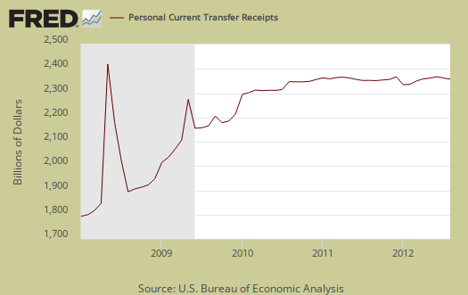
Below is adjusted for inflation personal income minus personal current transfer receipts. This graph shows how much personal income increased that wasn't funded by the government and is used as a recession indicator as show in the below graph with the gray bars indicating recessions. Transfer receipts are payments from the government to individuals where no actual services (work) was performed. This includes social security, unemployment insurance, welfare, veterans benefits, Medicaid, Medicare and so on.

Transfer receipts monthly change was -0.1%, not adjusted for inflation.
Personal current transfer receipts decreased $1.4 billion in August, in contrast to an increase of $9.5 billion in July. Within current transfer receipts, government social benefits to persons for Medicare increased $2.3 billion, compared with an increase of $6.9 billion.
Recall how social security is projected to run out of money to the contributions to social security for this month from paychecks:
Contributions for government social insurance -- a subtraction in calculating personal income --increased $0.7 billion in August, compared with an increase of $1.4 billion in July.
People need jobs, in order to pay into social security. Below is a graph of just transfer receipts.
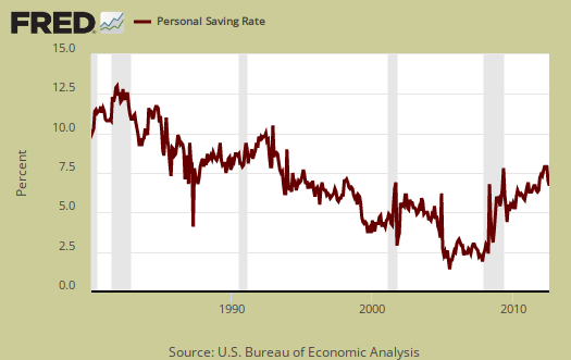
Personal savings is disposable income minus outlays, or consumption and not adjusted for inflation. The Personal Savings Rate was 3.7% in August. July's personal savings rate was 4.1%.
Below is disposable personal income minus personal consumption expenditures monthly raw total changes. When we see this spike we know people are not spending in relationship to the income they have available.

Personal Outlays means what goes out of your pocket and thus into the economy. Personal outlays are PCE, personal interest payments, and personal current transfer payments. PCE is defined above by percentages is almost all of personal outlays. Personal interest payments are things like the interest you pay on your credit card. Personal transfer payments are defined as:
Payments consisting of transfer payments by persons to government and to the rest of the world. Payments to government include donations, fees, and fines paid to Federal, state, and local governments, formerly classified as "personal nontax payments."
In other words, personal transfer payments are nothing more than that speeding ticket you just got or how you just donated to this site. People often confuse transfer payments with transfer receipts, not the same thing.
To visualize more data from this report, consider playing around with more of the St. Louis Federal Reserve Fred graphs.
Here is our overview from last month and overviews of GDP are here.
This overview details the BEA Personal Income and Outlays statical release, which covers individual income, consumption and savings. The personal income & outlays report is annualized and seasonally adjusted, although most percentages are presented as monthly rates.
One Percent, 99 Percent
These charts would look different if you did them for the 1 percent and 99 percent separately. The 1 percent is enjoying record profits, and since their taxes are so low (thanks to Reagan) they take a lot of that profit as income. Our incomes aren't going anywhere and in fact I've seen statistics that show them flat since Reagan, and then starting to decline in the past few years. The Census Bureau released a set of such figures a few weeks ago. By lumping everyone together here, it conceals that. It makes it look better than it is.
ya got that right, personal income, PCE doesn't break down
There are not quintiles available in this statistical release. But you are right and why we do the per capita graph at least. We have many other articles overviewing income by quintiles and wage brackets and all show the 1% getting the pie. In this article we show a pie graph.
Indeed you have...
I came to this story from my Google news page, left my comment, and didn't realize what you're about until I'd clicked on some of the links. This is great site and in fact I recognize a couple articles already that I've seen reproduced or linked to elsewhere.
I seem to detect the mainstream media looking into the statistics a little more closely along the lines you do and it has to be because of people like you putting the information out there. They have to, because it's already out there.
The Occupy movement raising the nation's consciousness helped a lot (as has President Obama's desperate election year conversion to economic populism) but the Occupy people were awakened by people like you. Thanks. I'm going to link to this site on my web log and write a post about it.
Thank you, also reproduced?
We sure as hell hope so, else MSM should hire us to write up overviews. ;)
We are part of Google news and we have a nice little feature from Google news to help push up stories, which I use when the press gets something oh so wrong and everyone is busy reading their oh so wrong analysis.
Google in this regard is cool, they hand review sites but going off of Journalistic standards, not squeezing out the little people, unlike Bing or Yahoo do. (and they do, only the news that's fit to match their lobbyist agendas!)
One of the reasons I started going into so much detail on statistical releases (with the help of awesome, mega fast graphing St. Louis Reserve FRED system), is because the press as well as the blogs gets this stuff oh so wrong. Even now, all weekend long we saw the MSM claim "consumer spending soared", when it's simply not so. More inflation soared folks, that's the difference between the 0.5% and 0.1% monthly increase. Additionally gasoline soared is more the truth of it.
Of course the MSM put income in their press reports almost as a footnote.
Someone actually passed a positive law in the 1990's to make government data publicly available, so anyone can do this. Of course they have to understand how to read those releases. Beyond graphing, we are addicted to eye candy and we hope that gives others the visuals to digest the trends....
But bottom line, we hope we're providing a bridge from the actual government statistical release, data, to what it means in real life for real people and not Wall Street, on this site.
Also, to correct the bumbling mistakes we see every day and certain press outlets are WAY more guilty on this than others.
==============
Getting our content lifted without permission isn't cool. We LOVE links, attributions, blog rolls and "did you see this" generally among the economic community, including OWS. Even summaries reposted are ok, along with links, because that brings more people to our site, but just brazen taking our content and reposting it is not cool. Gez, we can barely cover our server costs as it is.