
The June personal income and outlays report shows a 0.4% increase in consumer spending. When adjusted for inflation, consumer spending rose 0.3%. Personal income increased 0.2% while real disposable income increased 0.1% for the month. This is decent growth in PCE. From a year ago, real consumer spending has increased 2.8% while real disposable income has increased 2.2%. Once again income is blunted while spending soars. Consumer spending is roughly two-thirds of GDP. Real means adjusted for inflation and is called in chained 2009 dollars
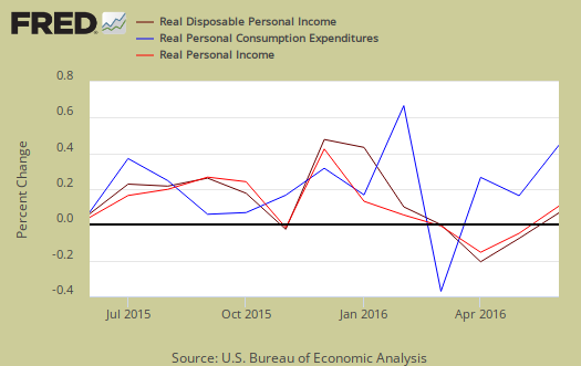
Disposable income is what is left over after taxes and increased 0.1% when adjusted for prices. Graphed below are the monthly percentage changes for real personal income (bright red), real disposable income (maroon) and real consumer spending (blue).
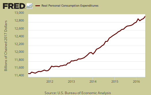
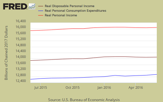
Below are the real dollar amounts for real personal income (bright red), real disposable income (maroon) and real consumer spending (blue) for the last year. Real personal income also increased 0.1% for the month.
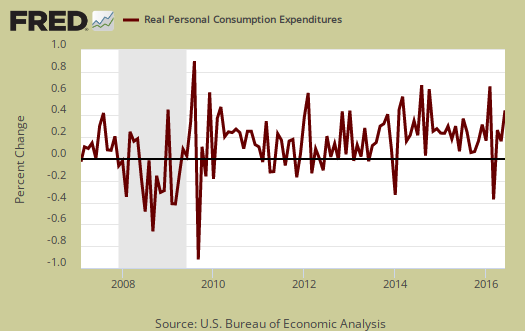
Consumer spending encompasses things like housing, health care, food and gas in addition to cars and smartphones. This month the increases in PCE were due to healthcare spending, electricity and gas while new motor vehicle spending declined. Graphed below is the overall real PCE monthly percentage change.
Below are the real monthly percentage changes in 2009 chained dollars:
- Durable goods: 0.4%
- Nondurable goods: 0.3%
- Services: 0.3%
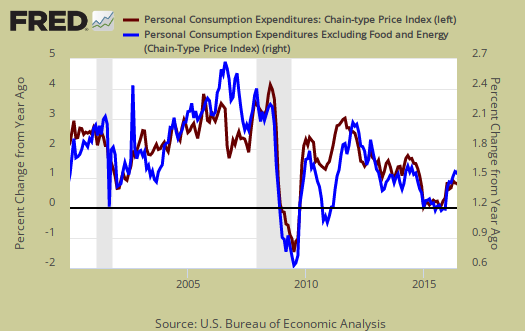
Price indexes are used as divisors to adjust for inflation and price changes. The price index increased 0.1%, while May's price index increased 0.2% The price index is now up 0.9% from a year ago. Minus energy and food, the price index increased 0.1% from last month and is up 1.6% from this time last year. The PCE price index represents inflation,but is different from CPI, although the two typically mirror each other.
Graphed below is the PCE price index, in red, scale on the left, and the PCE price index minus food and energy in blue, scale on the right. This is the percent change from one year ago.
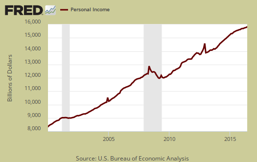
Personal income is total income, from all sources, for everybody in the United States who reported and are not part of the underground economy. Below is personal income, not adjusted for inflation, or price changes. Personal income was an annualized $15,883.0 billion, a 0.2% monthly increase.
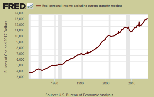
The BEA reports real personal income or income adjust for inflation, as real personal income minus transfer receipts. This is government payments, such as social security, removed and also adjusted for inflation. Real personal income minus transfer receipts increased 0.1% for the month. The graph shows how much personal income increased that wasn't funded by the government and is used as a recession indicator as show in the below graph with the gray bars indicating recessions. Transfer receipts are payments from the government to individuals where no actual services (work) was performed. This includes social security, unemployment insurance, welfare, veterans benefits, Medicaid, Medicare and so on.
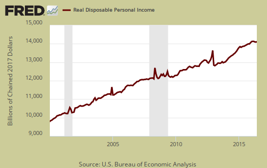
Disposable income is what is left over after taxes. DPI increased 0.2% from last month. DPI adjusted for inflation (see the price indexes above), increased 0.1%, from the previous month. These numbers are aggregates, which includes income of the uber-rich, or the 1% of the population, as they are now called. Below is real DPI by levels.
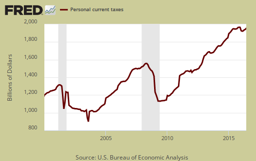
Taxes collected on person income increased 0.2% from last month. Below is a graph of personal income taxes.
Graphed below is real disposable income per capita. Per capita means evenly distributed per person and population increases every month. While income in the U.S. grows so does the population which earns that total pot of income. Notice how real disposable income per person really started to flatline in 2000. One can see the impact on labor arbitrage when looking at income per capita.

Wages and Salaries increased by 0.3%. Overall employment compensation also increased by 0.3%. . Graphed below are wages and salaries since 2000. Note the dip and the more flat line than earlier in the decade. These are aggregate, or all wages and salaries, and not adjusted for inflation.

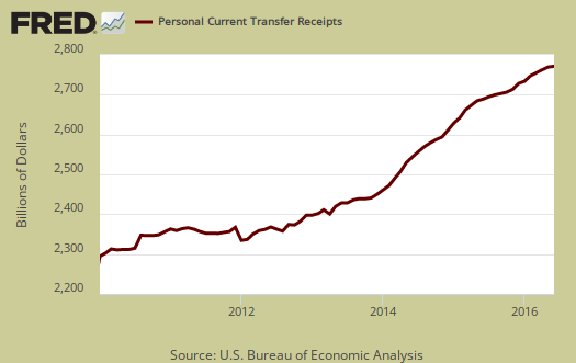
Transfer receipts, which are things like social security had no change from May and is not adjusted for inflation. Below is a graph of just transfer receipts.
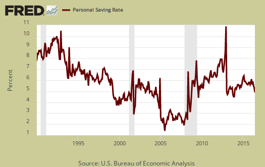
Personal savings is disposable income minus outlays, or consumption and not adjusted for inflation. The Personal Savings Rate was 5.3%.
Overall most in the press are claiming personal consumption expenditures were red hot in June. We believe the weather was red hot, not actual spending as the increases were in electricity and more healthcare costs. Maybe healthcare costs look good on GDP paper, but for real people having to lay out more oof their money to insurance premiums and getting less for it is not a quality of life good thing.
Consumer spending and personal income were also adjusted going back three years and is reflected in the above graphs.
To visualize more data from this report, consider playing around with more of the St. Louis Federal Reserve Fred graphs. Here are our overviews of personal income & outlays and overviews of GDP are here. This overview details the BEA Personal Income and Outlays statical release, which covers individual income, consumption and savings. The personal income & outlays report is annualized and seasonally adjusted, although most percentages are presented as monthly rates.
Recent comments