Q2 2012 real GDP now shows 1.25% annualized growth after revisions. The advance second quarter GDP estimate was 1.5%, whereas the second revision reported 1.7% GDP growth. The BEA rounds their final GDP numbers, so the actual GDP reported was 1.3%. When we're grabbing economic crumbs, 0.05 percentage points makes a difference.

What the Q2 GDP third estimate shows is a barely breathing economy. Businesses shed inventories, consumers spent way less, a dramatic swing from the Q2 GDP advance report and investment generally is down from the 1st quarter. Shedding inventories can be a recession indicator. Durable goods spending literally vanished in Q2, also a recession indicator. The drought showed up in Q2 GDP, negatively impacting farm inventories and potentially other GDP components indirectly.
As a reminder, GDP is made up of: where Y=GDP, C=Consumption, I=Investment, G=Government Spending, (X-M)=Net Exports, X=Exports, M=Imports*.
The below table shows the percentage point breakdown of the individual components contribution to overall GDP from the Q2 advance to second revision release. The difference, or spread, between GDP revision components is by percentage point contributions to Q2 GDP. The BEA directly calculates these percentage point contributions by their components. Due to rounding the breakdown of percentage point contributions does not match the actual 1.25266% change in real GDP for Q2. Don't worry, this is not a government conspiracy, just these individual components, which in turn have a large number of inputs, are directly calculated from those numerous inputs and then rounded. Bottom line, 1.24% or 1.25% GDP, we're still in the tank economically speaking.
| Comparison of Q2 2012 GDP Component Revisions | |||
|---|---|---|---|
|
Component |
2nd Estimate |
3rd Estimate |
Spread |
| GDP | +1.73 | +1.24 | -0.49 |
| C | +1.20 | +1.06 | -0.14 |
| I | +0.40 | +0.09 | -0.31 |
| G | –0.18 | –0.14 | +0.04 |
| X | +0.82 | +0.72 | -0.10 |
| M | –0.51 | –0.49 | +0.02 |
The below table shows the percentage point spread breakdown from Q1 to Q2 GDP major components.
| Comparison of Q1 2012 and Q2 2012 GDP Components | |||
|---|---|---|---|
|
Component |
Q1 2012 |
Q2 2012, 3rd |
Spread |
| GDP | +1.96 | +1.24 | -0.72 |
| C | +1.72 | +1.06 | -0.66 |
| I | +0.78 | +0.09 | -0.69 |
| G | –0.60 | –0.14 | +0.46 |
| X | +0.60 | +0.72 | +0.12 |
| M | –0.54 | –0.49 | +0.05 |
As we can see in the first table, gross domestic private investment imploded. It's not just the change in private inventories but overall investment petered out. For fixed investment component of gross domestic private investment, we have a 0.56 percentage point contribution to Q2 GDP. Q1 GDP showed a 1.18 percentage point contribution, so we have a deceleration of -0.62 percentage points between quarters. This is private, not from the government investment and breaks down into nonresidential and residential (housing) investment.
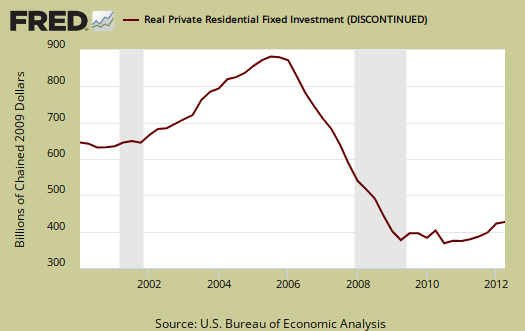
Residential fixed investment was +0.19 percentage point contribution to Q2 GDP, in comparison to a +0.43 percentage point contribution in Q1. graphed below is real residential investment. One can see the housing bubble collapse in the below graph and also how there is no meteoric recovery for Q2, in spite of all of the housing data hype.
Nonresidential fixed investment was a +0.36 percentage point contribution to Q2 GDP. Q1 shows a +0.74 percentage point contribution. This is a deceleration of -0.38 percentage points between quarters. Structures were nowhere, a +0.02 percentage point GDP contribution. Within equipment and software investments, Information processing equipment and software contributed negatively, a -0.09 percentage point contribution to Q2 GDP.

The change in private inventories alone gave a –0.46 percentage point contribution to Q2 GDP in the third revision. The advance GDP estimate showed a +0.32 percentage point contribution by the changes in private inventories. The 2nd estimate shows a -0.23 percentage point contribution. This is a -0.78 percentage point spread from the advance to the 3rd GDP estimate release and a -0.07 percentage point contribution increase from Q1. Below are the change in real private inventories and the next graph is the change in that value from the previous quarter.

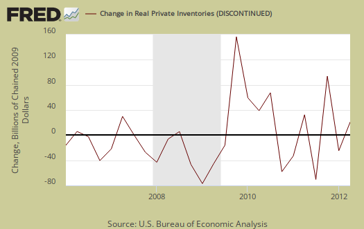
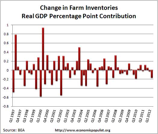
The breakdown of those changes is farm inventories' change contributed a –0.17 percentage points while all other business inventories contributed a –0.29 percentage point contribution. Farm inventories were affected by the drought. The BEA even broke down the drought effects further. From their technical note:
In current dollars, second-quarter crop output was revised down about $12 billion, and market sales were revised down about $4 billion, leading to a downward revision in farm inventories of $7.8 billion. After adjusting for inflation, the change in real farm inventories was revised down $5.7 billion (chained 2005 dollars) for the second quarter.
Yet in spite of that changes in farm inventories has actually impacted GDP much more in the past. To show this, the graph below shows the historical percentage point contribution of the change in farm inventories.
Motor Vehicles GDP contribution was a +0.20 percentage point GDP contribution. Computer final sales, was -0.10 by percentage points. This is a decline from Q1 where motor vehicles added +0.72 percentage points to GDP and computer final sales at least didn't subtract; they added 0.02 percentage points to Q1 GDP. Motor vehicles are different from personal consumption, or C sub-component auto & parts, this is an overall separate index. Motor vehicles, computers are bought as investment, as fleets, in bulk, by the government and so forth.
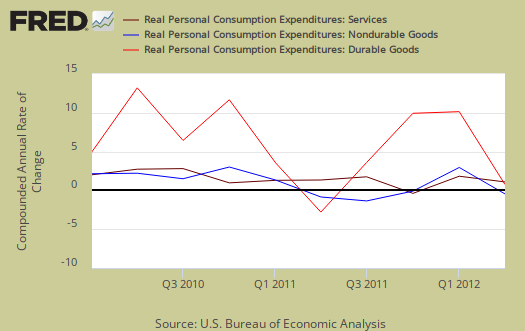
Consumer spending, C in our GDP equation, is simply horrific. Durable goods actually decreased again and is now a –0.02 percentage point contribution. The Q2 advance estimate was a +0.18 percentage point contribution and the 2nd estimate was +0.09. Motor vehicles and parts durable goods shows a –0.26 percentage point contribution to Q2 GDP.
The increase in consumer spending was all services, which shows a +0.99 percentage point contribution to GDP. Household utilities were +0.68 percentage points of household services consumption. It's even worse than that. There is something called consumption expenditures of nonprofit institutions serving households that is part of consumer spending and boils down to their operating expenses. That said, this includes health care and services provided by the government, as well as private and their operating expenses added +0.29 percentage points to PCE, services. That's really not a good sign. Below is PCE with the quarterly annualized percentage change breakdown of durable goods (red or bright red), nondurable goods (blue) versus services (maroon).
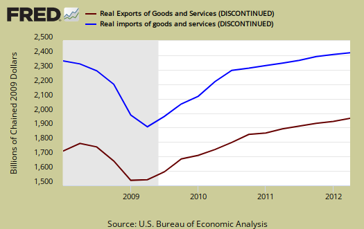
Imports are greatly impacted by real values and adjustments for prices from overseas to obtain their real value in the U.S. domestic economy, also adjusted for inflation. Imports were dramatically overestimated it appears and now show a -0.49 percentage point contribution to Q2 GDP. Exports were significantly revised upward as show in the above tables. The below graph shows real imports vs. exports in billions. The break down of the GDP percentage change to point contributions gives a clear picture on how much the trade deficit stunts U.S. economic growth.
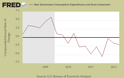
Government consumption and investments do add to U.S. economic growth in spite of the rhetoric one hears. Federal spending subtracted off only –0.02 percentage points while state & local spending cuts resulted in a –0.12 percentage point contribution, both improvements from Q1. Below is the percentage quarterly change of government spending, adjusted for prices, annualized.
The price index for gross domestic purchases, was only 0.7% for Q2, whereas Q1 was 2.5%. In other words, there was way less inflation than last quarter, corresponding to the drop in oil prices for Q2. Core price index, or prices excluding food and energy products, was 1.4%. Q1's core price index was 2.4%.
Nominal GDP: In current dollars, not adjusted for prices, Q2 GDP, or the U.S. output, is $15.586 trillion, a lousy 2.8% increase from Q1. The first quarter saw a 4.2% increase. Applying the price indexes, or chained, real 2005 dollars, Q2 2012 GDP was $13.549 trillion. Both numbers are annualized.
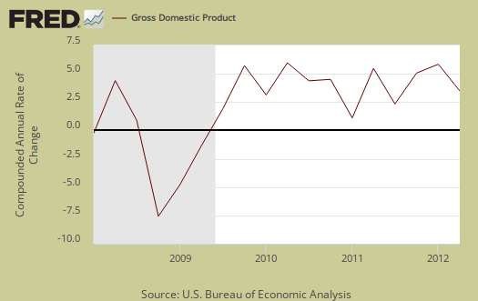
Gross domestic purchases are what U.S. consumers bought no matter whether it was made in Ohio or China. It's defined as GDP plus imports and minus exports or using our above equation: where P = Real gross domestic purchases. Real gross domestic purchases was 1.0%, whereas last quarter was 1.8%. Exports are subtracted off because they are outta here, you can't buy 'em, but imports, as well a know all too well, are available for purchase at your local Walmart. When gross domestic purchases exceed GDP, that's actually bad news, it means America is buyin' imports instead of goods made domestically.
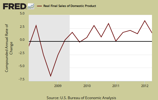
Below are real final sales of domestic product, or GDP - inventories change. This gives a better feel for real demand in the economy. This is because while private inventories represent economic activity, the stuff is sitting on the shelf, it's not demanded or sold. Q2 Real final sales increased 1.7% for Q2, whereas real final sales for Q1 were 2.4%.
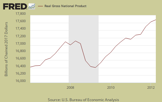
GNP - Gross National Product: Real gross national product, GNP, is the goods and services produced by the labor and property supplied by U.S. residents.
GNP = GDP + (Income receipts from the rest of the world) - (Income payments to the rest of the world)
Nominal GNP was $15.833 trillion for Q2, real GNP was $13.764 trillion. Real GNP increased 2.1% in Q2 whereas in Q1 GNP increased 0.6%. Net receipts of income from the rest of the world increased $27.4 billion in Q2 after decreasing $44.1 billion in Q1. For Q2, receipts increased $3.5 billion, and payments decreased $24.0 billion.
Below are the percentage changes of Q2 2012 GDP components, from Q1. There is a difference between percentage change and percentage point change. Point change adds up to the total GDP percentage change and is reported above. The below is the individual quarterly percentage change, against themselves, of each component which makes up overall GDP. Additionally these changes are seasonally adjusted and reported by the BEA in annualized format.
|
Q2 2012 Component Percentage Change (annualized) |
|||
|---|---|---|---|
| Component | Percentage Change from Q1 | ||
| GDP | +1.3% | ||
| C | +1.5% | ||
| I | +0.7% | ||
| G | –0.7% | ||
| X | +5.3% | ||
| M | +2.8% | ||
The BEA's comparisons in percentage change breakdown of 2nd quarter GDP components are below. Changes to private inventories is a component of I.
C: Real personal consumption expenditures increased 1.5 percent in the second quarter, compared with an increase of 2.4 percent in the first. Durable goods decreased 0.2 percent, in contrast to an increase of 11.5 percent. Nondurable goods increased 0.6 percent, compared with an increase of 1.6 percent. Services increased 2.1 percent, compared with an increase of 1.3 percent.
I: Real nonresidential fixed investment increased 3.6 percent in the second quarter, compared with an increase of 7.5 percent in the first. Nonresidential structures increased 0.6 percent, compared with an increase of 12.9 percent. Equipment and software increased 4.8 percent, compared with an increase of 5.4 percent. Real residential fixed investment increased 8.5 percent, compared with an increase of 20.5 percent.
X & M: Real exports of goods and services increased 5.3 percent in the second quarter, compared with an increase of 4.4 percent in the first. Real imports of goods and services increased 2.8 percent, compared with an increase of 3.1 percent.
G: Real federal government consumption expenditures and gross investment decreased 0.2 percent in the second quarter, compared with a decrease of 4.2 percent in the first. National defense decreased 0.2 percent, compared with a decrease of 7.1 percent. Nondefense decreased 0.4 percent, in contrast to an increase of 1.8 percent. Real state and local government consumption expenditures and gross investment decreased 1.0 percent, compared with a decrease of 2.2 percent.
Bottom line Q2 2012 GDP is actually worse than just the 1.3% or 1.25% implies due to what types of things changed in the part of the economy which make up GDP. This is why this overview goes into such nitty gritty for the details cast a much broader shadow over the U.S. economy.
Here are past overviews for the GDP, text unrevised, most graphs are updated.
* In Table 2, the BEA reports GDP contribution components with their equation sign. If durable goods for example, decreased over the quarter or year, it is reported as a negative number. Imports, from the GDP equation, are already a negative for that is not something produced domestically. A negative sign implies imports increased for the time period and a + sign means the change in imports decreased. Or, from the GDP equation: . Confusing but bottom line exports add to economic growth, imports subtract.

any questions on GDP, please leave a comment
I really dug into the revisions for I found such ominous signs contained in the numbers.
I like to look at percentage point contributions because inherent in these figures is the rate of change from the previous quarter and I think it gives the best picture on the change in the breakdown. Graphs are in different forms but primarily correspond to the bottom percentage change of individual components, against themselves, from the previous quarter.
This overview is dense, I know, and I hope it's understandable. If not, please leave a comment so we can improve to make the GDP report more easy to see what the numbers really mean to us regular folk.
It ain't good, I'm really trying to tell ya all.
those blaming the drought on these revisions
It's not correct. The big area where the drought showed up was in farm inventories, but the change represents only -0.19 of the -0.49 percentage point drop from the 2nd revision, or 39% of the downgrade.
Can't find any good news globally
Try as I might, I just can't see it. US election doesn't bring job growth either way (there simply is no viable plan or even talk of a real jobs plan for American citizens and we all know the benefactors of status quo behind the scenes keep blaming "uncertainty" for this or that, but the common man and woman continues to suffer without end), debt ratios in Europe are astounding, and I'm talking about UK, Spain, Italy, with Germany in recession or headed into one, not even discussing Greece, Portugal, and central banks and politicians demand more and more austerity and fewer safety nets while doing nothing to actually employ their own people. China's economy and political scene as tumultuous as ever as evidenced by shakeups, criminal prosecutions against those the Party no longer endorses, etc. as new leadership takes over. Chinese economy headed south assuming that current stats are even reliable as to how well China was doing to begin with. Australia's mining industry (i.e., Australia's economy) relies heavily on Chinese growth, so that's not goood. Japan, still suffering after decades, plus the tsunami + nuclear issue. China (PRC, and Taiwan) and Japan, Vietnam, Philippines, S. Korea, India fighting over islands and waters that contain oil and fisheries and those areas become increasinly important as the price of Middle Eastern oil is likely to skyrocket due to Iran situation and any threats to production and/or transport near Iran and Strait of Hormuz. Iran nuclear issue, plus its support of Syria. Syria + Turkey + Iran + Jordan + Iraq + Russia issues over full-blown Syrian civil war. The workers of the world face explosive food + fuel + housing prices (renters will suffer more as banks take over rentals and keep houses out of reach), and central banks flood TBTF with free cash that inflates prices but never brings any jobs, so more inflation, less employment, more money kept at the top of bank administrations, and more geopolitical issues. But Bloomberg covered Spanish austerity for a few minutes yesterday before switching over to a married couple of awesome elites, the husband was a former corporate lawyer/Morgan Stanley employee and the wife ran a homeshopping network and they looked rich and happy, so I feel better and I guess we all should because they represent .00001% of the world, but hey, they were smiling and living the good life.
Hello!
I'm an Economics student and I'm having a hard time to deal with graphs and percentages. I just want to know the figures represented by those. Like how much did our government spend for our government purchases which is the "G" in the formula for GDP. Thanks!
there is real and then there is nominal
For Q2, real was 2.5 trillion in government spending, annualized
Q2 nominal G was 3.8 trillion, annualized.
To find out raw totals, first, these are seasonally adjusted and there is one main program, X-12 ARIMA used for seasonal adjustments, although each series has it's own seasonal pattern.
Annualization means what that looks like as if the quarter had happened the entire year.
So, annualized for quarters means raw total x 4 and then seasonally adjusted.
I suggest you familiarize yourself with these terms as well as read the BEA reports for it seems to read NIPAs this is their lingo.
At the top of our overviews always there is the link to the gov. agency and the actual statistical release, always in the 1st paragraph. There you can find the various raw totals. Reprinting what the BEA already puts out in their reports via tables seems redundant. Our overviews are to amplify certain data as well as create visuals on that data and then we hand number crunch additional statistics not mentioned or provided but from the raw data of the statistical release.