Previously in Part I of this series, I explained the need to re-examine economic indicators to determine how they performed in previous periods of deflation. In Part II, I looked at the year-over-year M1 vs. CPI indicator during the Roaring Twenties. In Part III, I looked at the same indicator during the 1930s and the post-World War 2 deflationary recession of 1948-49. That examination showed that, in the 1920-1950 period, the M1 vs. CPI indicator generally worked well, but missed the 1927 recession and most importantly of all completely failed to appropriately signal the beginning, duration, or end of the 1929-32 Great Contraction.
IV. Interest rates and the yield curve
In this installment, I will look at NY Fed interest rates, short term rates, and long term rates as they apply to the entire 1920-1950 period.
Readers may recall that whether the yield curve is inverted or not is considered a major leading indicator in the Conference Board's Index of Leading Economic Indicators, and also is one of two components of the Kariel Recession Indicator that has infallibly signaled recessions since 1960.
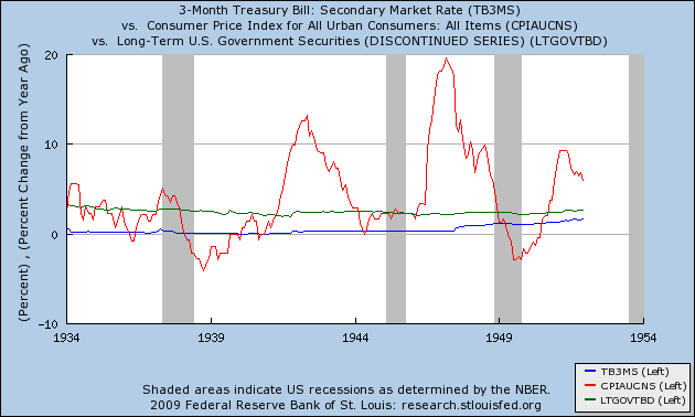
To begin with, as I stated at the outset of this series, the yield curve remained positive (i.e., longer term bonds paid more than shorter term bonds) through the entire period of the 1930s and 1940s. Here is the graph for 1934-1951, which includes 3 month treasury bills in blue, long term government bonds in green, and the CPI in red:

The graph again confirms that at no point before or during any of the 3 recessions during this period did the yield curve invert.
Let's turn back to the earlier periods, then. While before 1934 records of 3 month and 10 year treasuries specifically were not kept, the Federal Reserve did keep data on long term government bonds from 1925, and the NY Fed's interest rates are available from 1913 via the NBER. In his important paper on the Great Depression, Ben Bernanke used data from a commercial source (p. 6) to which I did not have access; however, the Federal Reserve does keep data on AAA corporate rates from 1913 on. During the 1924-30 period, AAA rates were generally 1% higher than long term government rates. By the expedient of subtracting 1% from the AAA rates from 1920-24, I have been able to duplicate Bernanke's graph of treasury rates (p. 7) +/- .25% which does not interfere with the conclusions below.
Here is the graph of interest rates during the 1920's, with NY Fed rates in blue, long term government rates in green, and the CPI in red:

This graph shows that, with the exception of a period in the mid 1920s, interest rates were not "easy", that is, they were above the inflation rate. The correlation between the yield curve and recessions ~12 months later as predicted by the 1960-2007 Kasriel indicator is imperfect at best. The yield curve remained inverted through October 1922, and re-inverted from February 1923-April 1924. The May 1923-July 1924 recession began and ended 1 year post-inversion, but the middle of that recession coincided with normal, positive interest rates. There was another, brief inversion between January-April 1926 that does generally fit with the recession of October 1926-November 1927. The long inversion that began in September 1926 does not coincide with any recession until the Great Depression began later in 1929.
More importantly, during both the hugely deflationary (to the point of nearly -50% YoY) 1920-22 recession, and from early 1928 on, the yield curve was inverted. In fact, during 1929, the inverted yield curve (with long term bonds ~1.5%-2.5% under short term rates), and featured Fed interest rates 6% over the inflation rate, the most serious inversion until 1981 when Paul Volker killed inflation by raising interest rates some 9% over the inflation rate.
Which brings us to the graph of interest rates during the Great 1929-32 Contraction:

A very tight, and inverted yield curve persisted until mid 1930, after which it reverted to a normal, positive range. Just outside the range of our graph, by early 1934 interest rates were both positive and easy, with NY Fed rates, at 1.5%, less than the rate of inflation.
In Conclusion, our look at interest rates during the 1920-1950 period shows that the yield curve inversion portion of the Kasriel indicator generally does not work, but that interest rates play a very important but different role than they did during the 1960-2007 Inflationary Era. While a positive yield curve did not necessarily mean economic expansion, an inverted yield curve in the presence of deflation meant that a severe deflationary contraction was set to occur, as happened during both the post WW 1 deflationary recession, and during the Great Depression of 1929-1932.
In my final installment, I will put together what we have learned both about monetary and interest rate indicators, with a hypothesis about their applicability to predict deflationary recessions and recoveries; and then I will apply them to our current deflationary recession. At least one ominous surprise awaits.

Comments
Great work NDD
When you break this up in a series like this, I feel like I'm watching some mini-series on TV where the suspense is left for the next episode. ;)
another tutorial type of post that might be cool is reviewing Bernanke's paper/conclusions and see just how well they correlate to current economic reality. Just a suggestion.